The New |
|||||||||||||||||||||||||||||||||||||||||||||||||||||||||||||||||||||||||||||||||||||||||||||||||||||||||||||||||||||||||||||||||||||||||||||||||||||||||||||||||||||||||||||||||||||||||||||||||||||||||||||||||||||||||||||||||||||||||||||||||||||||||||||||||||||||||||||||||||||||||||||||||||||||||||||||||||||||||||||||||||||||||||||||||||||||||||||||||||||
Download Chapter 6 |
6
More about Data Analysis When the fieldwork is done and the data entry completed, the fun really begins. To illustrate some more principles of data analysis, let us assume that you are analyzing a public opinion poll. The first thing you want to see is the marginal frequencies: the number and percentage of people who have each of the possible responses to each of the questions in the survey. Determining this basic information is not as clear-cut as it sounds, however, and a few policy decisions must be made in advance. First
among them is the problem of dealing with answers of the don't-know, no-opinion,
and no-answer variety. Do you leave them in the base for calculating percentages,
or do you take them out? It can make a difference. Suppose you ask 500
people, "On the whole, do you approve or disapprove of the way the mayor
is handling his job?" and you get the following distribution:
The total in this case is 101 percent because of rounding errors. No need to be compulsive about that. If survey research were a totally precise and reliable instrument, you might be justified in reporting fractional values. But it isn't, and using decimal points gives a false sense of precision which you may as well avoid. Now looking at the above percentages, the sensation-seeking beast that lurks in all of us spots an opportunity for an exciting lead: "Mayor Frump has failed to gain the approval of a majority of the adult residents of the city, an exclusive Daily Bugle poll revealed today." However,
it is possible to give the mayor his majority support by the simple expedient
of dropping the "no answers" from the percentage base. Using the same numbers
based on the 460 who responded to the question, we find:
There
is yet a third possibility, basing the percentages on the total number
of people who have opinions about the mayor:
Deciding what to count So here you sit with a survey containing perhaps two hundred questions, and each of them is subject to three different interpretations. You are a writer of news stories, not lengthy scholarly treatises. What do you do? A rule set forth in the previous chapter is so important that it is worth repeating here: "Don't know" is data. The soundest procedure is to base your percentages on the nonblank answers, as in the second of the three examples cited above. It is theoretically justifiable because not answering a particular question is in somewhat the same category as not responding to the entire questionnaire. The reasons for no answer are varied: the interviewer may have been careless and failed to mark that question or failed to ask it, or the respondent may have refused to answer. In any case, failure to answer may be treated as not being in the completed sample for that particular question. You should, of course, be on the lookout for items for which the no-answer rate is particularly high. They may be a tipoff to a particularly sensitive or controversial issue worth alerting your readers about; and you will, of course, want to warn the reader whenever you find meaningful responses that are based on considerably less than the total sample. Usually, however, the no-answer rate will be small enough to be considered trivial, and you can base your percentages on the nonblank answers with a clear conscience and without elaborate explanation. The don't-know category is quite different. The inability of a respondent to choose between alternatives is important information, and this category should be considered as important data -- as important as that furnished by people who can make up their minds. In an election campaign, for example, a high undecided rate is a tipoff that the situation is still unstable. In the example just examined it suggests a substantial lack of interest in or information about the mayor -- although these are qualities best measured more directly. Therefore, you should, as a matter of routine, include the don't-knows in the basic frequency count and report them. When you judge it newsworthy to report percentages based on only the decided response, you can do that, too. But present it as supplementary information: "Among those with opinions, Mayor Frump scored a substantial . . ." When
you do your counting with a computer, it is an easy matter to set it to
base the percentages on the nonblank answers and also report the number
of blanks. If you are working with SAS or SPSS, the frequency procedures
will automatically give you percentages both ways, with the missing data
in and out.
Beyond the marginals Either
way, you can quickly size up your results if you enter the percentages
on an unused copy of the interview schedule. Before going further, you
will want to make some external validity checks. Are males and females
fairly equal in number? Does the age distribution fit what you know about
the population from other sources, such as census data? Does voting behavior
fit the known results (allowing for the expected overrecall in favor of
the winning candidates)? With any luck, each of these distributions will
fall within the sampling error tolerances. If not, you will have to figure
out why, and what to do about it. Once you know the percentage who gave
each of the alternative responses to each of the questions, you already
have quite a bit to write about. USA Today can produce a newspaper
column from three or four questions alone. However, the frequencies --
or marginals, as social scientists like to call them --
are not the entire story. Often they are not even
very interesting or meaningful standing by themselves. If I tell you that
75 percent of the General Social Survey's national sample says the government
spends "too little" on improving the environment, it may strike you as
mildly interesting at most, but not especially meaningful.
To put meaning into that 75 percent figure, I must compare it with something
else. If I tell you that in a similar national sample two years earlier,
only 68 percent gave that response, and that it was 59 percent four years
earlier, you can see that something interesting is going on in the nation.
And that is just what the General Social Survey did show in the years 1989,
1987, and 1985. A one-shot survey cannot provide such a comparison, of
course. However, if the question has been asked in other surveys of other
populations, you can make a comparison that may prove newsworthy. That
is one benefit of using questions that have been used before in national
samples. For example, a 1969 survey of young people who had been arrested
in December 1964 at the University of California sit-in used a question
on faith in government taken from a national study by the Michigan Survey
Research Center. The resulting comparison showed the former radicals to
have much less faith in government than did the nation as a whole.
Internal comparisons Important opportunities for comparison may also be found within the survey itself. That 75 percent of Miami blacks are in favor of improving their lot through more political power is a fact which takes on new meaning when it is compared to the proportion who favor other measures for improvement. In a list of possible action programs for Miami blacks, encompassing a spectrum from improving education to rioting in the streets, education ranked at the very top, with 96 percent rating it "very important." Violent behavior ranked quite low on the list. And this brings us anew to the problem of interpretation raised in the opening chapter of this book. You can report the numbers, pad some words around them, the way wire-service writers in one-person bureaus construct brief stories about high school football games from the box scores, and let it go at that, leaving the reader to figure out what it all means. Or you can do the statistical analog of reporter's leg-work, and dig inside your data to find the meaning there. One example will suffice to show the need for digging. A lot has been written about generational differences, particularly the contrast between the baby boomers and the rest of the population. And almost any national survey will show that age is a powerful explanatory variable. One of the most dramatic presentations of this kind of data was made by CBS News in a three-part series in May and June of 1969. Survey data gathered by Daniel Yankelovich, Inc., was illustrated by back-to-back interviews with children and their parents expressing opposite points of view. The sample was drawn from two populations: college youth and their parents constituted one population; noncollege youth and their parents the other. Here is just one illustrative comparison: Asked whether "fighting for our honor" was worth having a war, 25 percent of the college youth said yes, compared to 40 percent of their parents, a difference of 15 percentage points. However, tucked away on page 186 on Yankelovich's 213-page report to CBS, which formed the basis for the broadcasts, was another interesting comparison. Among college-educated parents of college children, only 35 percent thought fighting for our honor was enough to justify a war. By restricting comparison to college-educated people of both generations, the level of education was held constant, and the effect of age, i.e., the generation gap, was reduced to a difference of 10 percentage points. Yankelovich
had an even more interesting comparison back there on page 186. He separated
out the noncollege parents of the noncollege kids to see what they thought
about having a war over national honor. And 67 percent of them were for
it. Therefore, on this one indicator we find a gap of 32 percentage points
between college-educated adults with kids in college and their adult peers
in noncollege families:
Obviously, a lot more is going on here than just a generation gap. The education and social-class gap is considerably stronger. Yankelovich pursued the matter further by making comparisons within the younger generation. "The intra-generation gap, i.e., the divisions within youth itself," he told CBS a month before the first broadcast, "is greater in most instances than the division between the generations." The
same thing has turned up in other surveys. Hold education constant, and
the generation gap fades. Hold age constant, and a big social-class gap
-- a wide divergence of attitudes between the educated and the uneducated
-- opens up. Therefore, to attribute the divisions in American society
to age differences is worse than an oversimplification. It is largely wrong
and it obscures recognition of the more important sources of difference.
CBS, pressed for time, as most of us usually are in the news business,
chose to broadcast and illustrate the superficial data which supported
the preconceived, conventional-wisdom thesis of the generation gap.
Hidden effects Using three-way cross-tabulation to create statistical controls can also bring out effects that were invisible before. When Jimmy Carter ran for president in 1976, the reporters using old-fashioned shoe-leather methods wrote that his religious conviction was helping him among churchgoers. Then the pollsters looked at their numbers and saw that frequent churchgoers were neither more nor less likely to vote for Carter than the sinners who stayed home on Sunday. These data from a September 1976 Knight-Ridder poll illustrate what was turning up:
The two above examples are
rather complicated, and you can't be blamed for scratching your head right
now. Let's slow down a bit and poke around a single survey. I like the
Miami Herald's pre-riot survey as a case study because of its path-breaking
nature, and because the analysis was fairly basic. We shall start with
a simple two-way table. A two-way (or bivariate) table simply sorts a sample
population into each of the possible combinations of categories. This one
uses age and conventional militancy among Miami blacks. In the first pass
through the data, age was divided four ways, militancy into three.
Because
the marginal totals are unequal, it is hard to grasp any meaning from the
table without converting the raw numbers to percentages.
Because militancy is the dependent variable, we shall base the percentages
on column totals.
There
are too many numbers here to throw at your readers. But they mean something
(the chi-square value -- computed from the raw numbers -- is 20, which,
with six degrees of freedom, makes it significant at the .003 level). And
the meaning, oversimplified--but honestly oversimplified, so we need make
no apology -- is that older people aren't as militant as younger people.
We can say this by writing with words and we can also collapse the cells
to make an easier table.
This table also eliminates the marginal percentages. The sums at the bottom are just to make it clear that the percents are based on column totals. The
problem of figuring which way the percentages run may seem confusing at
first, but eventually you will get the hang of it. To make it easier, most
of the tables in this book base the percentages on column sums. Thus the
dependent variable -- the quality being dissected -- is listed across the
rows. No law of social science requires this arrangement. We could just
as logically put the dependent variable in columns and figure percent across
rows. In some cases, to clarify a distribution, you may want to base percentage
on the table total, i.e., the sum in the corner of the margins. But for
now we shall standardize with the dependent variable reported across rows
and the percentages based on totals down the columns.
Standardizing your tables With this standard presentation, you can quickly gain the habit of letting your eye rove from left to right to find the percent difference. The table comparing the proportion of younger and older people among the militants shows older people have half again as many conservatives or low militants among them as younger people have: 31 percent vs. 21 percent. And that is a fairly good way to explain it to the reader. But if it takes you some time to develop your table-reading skill so that the figures leap off the page at you, bright and meaningful, consider the plight of the reader. Your practice and skill at interpretation do not help him or her, and so you have to reduce things to words or to bare numerical essentials, or both in combination. One way to ease the burden on the reader is to give him or her one-way tables, created by lopping off the less dramatic half of the two-way table. Even then, you should add some words to tell what the numbers are saying. Here is how the relationship between militancy and age could be presented: MILITANCY AND AGE Older people tend to be more conservative than younger people.
The
other half of the table, the percent nonmilitant in each category, is implied.
And the table makes clear that the numbers are percentages within age categories.
What about the don't-knows? Shouldn't there be cells in the table for them? Not in this case. The militant was operationally defined as someone who gave militant answers to six of the eight questions in the index. "No answer," therefore, counted as a nonmilitant answer. Had the number of blanks for any one of the items been unusually high, some theoretical problems could have been raised. They weren't. In a few cases, interviewers failed to record age, and those cases were automatically eliminated from the table. Now we must reflect a bit on what we have added to the newspaper reader's knowledge here. We have made a comparison between young and old and demonstrated that militancy is found more frequently among the young. That in itself is something of an achievement because it provides a fuller description of the phenomenon of militancy than was available before we produced the table. Age and militancy are related. Can we go beyond that and assume that the relationship involves causation? Nothing in the numbers themselves demonstrates that the relationship is a causal one. To make the leap to a causal assumption, we have to use some logic, a bit of intuition, and common sense. And that, you may remember from an earlier chapter, is why we keep referring to one variable as the dependent variable and the other as the independent variable. This description is the most parsimonious and conservative one available. We can say that we are looking for evidence that militancy depends on age without committing ourselves to talking about causation. The statement that the amount of militancy depends on age is purely a descriptive one. (Or, if the row comparisons had turned out to be about equal, we could have said that militancy does not depend on age.) Now let us look at this particular table and bring some logic to bear on it. If there is a relationship between the two variables, then it could be because one of them is a cause of the other. But which way does the causal arrow run? In this case, it is easy to eliminate the hypothesis that militancy causes age. Chronological age, more's the pity, is fixed and unchangeable, so the arrow must run the other way. Other readily measured attributes possess the same advantage in deducing causality: sex, race, birth order within the family are examples. Because they are unchangeable, we can assume that they are causes and not effects, if there is causation. For illustration, we return to the case of the Miami blacks. Militancy can't cause people to be young, but the reverse proposition, that being young causes them to be militant, also lacks a good deal. What we really want to know is what it is about being young that makes people militant. The way to find out is to look first for other dimensions where young people differ from old: education, for example. People in all social classes tend to be better educated than their parents. Among Miami blacks more than 24 years old, 25 percent had high school diplomas. Only 12 percent of their fathers were high school graduates. Furthermore, we can expect militancy to increase with education. Knowing
this, we then suspect that it may not be youth per se that causes
militancy, but merely the fact that young blacks are better educated, and
that better education is the real cause of militancy. To test this idea,
we first verify our suspicion that education is related to militancy. And
indeed it is. Reducing the table to a newspaper-compatible form produces
the following evidence that militancy increases with education.
(The
full table, with seven categories of education and three of militancy,
has a chi-square value of 33, significant at the .001 level with 12 degrees
of freedom.)
At first glance, education seems to have even more to do with militancy than does age. Perhaps age is not a "real" factor at all. Maybe it is simply a cause of education, which is then the more direct cause of militancy. To
test this idea, we introduce what Morris Rosenberg calls
a test factor.2
Another word for it is control. As in the CBS report, we want to control
for age -- this time to examine the relationship between militancy and
education. Controlling for age means to hold its effect constant by looking
at the effect of education on militancy within each age category. This
process is analogous to the laboratory scientist who, by repeating his
experiment in a variety of temperatures, makes certain that variation in
room temperature is not affecting his chemical reaction.
Tables with three dimensions The result of such an examination is a three-way table: militancy by education by age. In physical printout, it is a two-way table repeated for each educational category -- the only way that a three-dimensional table can be reproduced on two-dimensional paper. Several things might happen: 1. The education-militancy relationship could disappear within each of the age groups. If so, age, not education, is the cause of militancy. Age, in fact, is a common cause of both education and militancy and the apparent education-militancy relationship is spurious. 2. The education-militancy relationship could remain in each of the age categories. In this case, age and militancy are both links in the causal chain. Logic tell us that age, being fixed, comes first. Therefore, youth causes education and education causes militancy. 3. The education-militancy relationship could disappear in some of the age categories and remain the same or become stronger in others. If so, some kind of interaction effect is operating. There are special circumstances in which age and education work together to increase militancy -- more, perhaps, than simple addition of their separate effects would account for. Which of the above really happened in the Miami case? To make it easy, we'll again collapse the tables to one dimension, looking at the percent militant in each age group, starting with the youngest. Remember, we are looking not at one table but four.
This example deals with a relationship between what Rosenberg calls a "property" (age) and "disposition" (militancy). Properties are unambiguous, things an individual is or isn't: white, German-born, grammar school graduate, blue-collar worker, 1968 Nixon voter, color-television owner, teetotaler, licensed airplane pilot, pack-a-day cigarette smoker. Dispositions are more difficult to get a grip on because they are qualities that need the presence of special situations in order to be activated. The black militant, i.e., a black person scoring high on the militancy scale, may or may not express his or her disposition by behaving in a militant manner, depending, normally, on the external situation he or she faces at any given moment. But the disposition is there and it is measurable. One of the things that some social scientists try very hard to do is to establish relationships between dispositions and behavior. Another school, however, holds that dispositions -- the attitudes, values, personality traits within the person ñ have much less to do with behavior than does the external situation. It is generally much easier to establish the relationship between a property and a disposition than to predict actual behavior, as in the case of the age-education-militancy chain. However, you can find news applications of both types, although you may find that you are unable to interest your editors or your readers in attitudinal relationships until dispositions are manifested in newsworthy behavior. We become interested in what blacks or students or public school teachers are thinking after they riot or eject the dean from his office or go on strike. Nevertheless, a news organization that takes the new methods seriously will try to monitor the attitudinal developments before matters reach the overt, obviously newsworthy, man-bites-dog level. If a man biting a dog is news, a man thinking about biting a dog is a potential scoop. If a disposition is the dependent variable, i.e., the thing being studied, you then can quickly find yourself in the business of searching for relationships between one disposition and another. In the Miami Herald's pre-riot survey of early 1968, one of the important dependent variables was disposition toward violence. It was measured with two questionnaire items, one dealing with general approval of violence to advance black goals and the other asking about the respondent's own intent to participate in such violence should the opportunity arise. The two items were combined to form a four-part index ranging from "violent" -- those who both favored violence as an idea and were ready to participate themselves -- to those who were opposed to both the concept and the personal act. It was then tested against a number of specific grievances to find out, first, whether grievances really do dispose people toward thoughts of violence, and, if so, which grievances had the most effect. One of the more clear-cut tables showed quite plainly that disposition toward violence was associated with dissatisfaction over one's personal housing situation.
However, young people tend
to be more educated and more discontent and also more violent. The question
arises, then, whether discontent with housing really has an effect on feeling
toward violence, or whether the two variables are merely common effects
of a more complicated bundle of attitudes that involved being young and
black. So the table was run again, this time controlling for age. To conserve
cases, the four violence categories were collapsed to two and the tables
were reduced to one dimension apiece for simplicity.
The
relationship persists in each age group, though it comes on significantly
stronger in the middle-aged, 36-50, group. Therefore, at least two things
are probably going on here: first, youth, or something about youth, causes
people to feel and express grievances over housing and the grievances in
turn stimulate favorable attitudes toward violence. But look at the third
age category. Housing is strongest as an explanatory variable for violence
in that age group for which it is most relevant: these are people in the
middle-to-late child-rearing years for whom being deprived of satisfactory
housing can be the most frustrating. Thus bad housing makes these people
disposed toward violence despite their age; age, negatively associated
with violence (the greater the age, the less the violence) has thus had
a suppressor effect in the previous two-way table, which tested for the
effect of housing dissatisfaction on violence.
Or, recasting this statement in shorter sentences: Disposition toward violence decreases with age. Disposition toward violence increases with housing dissatisfaction. Among middle-aged people, housing dissatisfaction relates so strongly to disposition toward violence as to outweigh the violence-suppressing effect of age. When you can pinpoint a group in which special circumstances make a relationship stand out with extra power and clarity you have a strong potential for an important news story. In Miami, urban affairs writer Juanita Greene found that housing frustrations for people in the child-rearing years were grounded in objective reality. The gap between housing need and housing availability was large and it was not being closed. This kind of spotting of special situations, by the way, is something that social scientists, in their quest for general theoretical principles, do not often do very well. "Social science has been justly criticized," says Rosenberg, "for its neglect of situational factors. One may know that general principles obtain, but one does not know whether these principles have predictive value in specific circumstances."3 Digging for specific circumstances may fit the instincts of the journalist better than those of the social scientist. Academic reluctance to ferret out the mundane details needn't inhibit us at all as we look for the traditional who, what, when, where, why, and how. Before leaving the violence-by-housing and satisfaction-by-age tables as compressed above, scan it once more to see how quickly you are becoming accustomed to letting the numbers leap off the page, bearing their message to you. Your eye automatically scans from left to right to show that housing attitudes relate to violence attitudes in all age groups. But you can also scan it vertically to see how attitudes favoring violence tend to fade with advancing age. The percent disposed to violence fades from 21 to 12 among those happy with housing conditions and from 33 to 20 among those unhappy with housing conditions. Furthermore, the exception, that 40 percent violent among the unhappy 36-50 group, cries out for attention and explanation. If,
on the other hand, you still have to stop and puzzle out the meaning, don't
worry. You are, after all, in the business of writing with words, not numbers.
But facility with the numbers will come with practice, particularly as
you apply them to work of your own and not just to examples printed in
a book. You may also take comfort from this thought: you are avoiding,
so far, the danger of becoming so fluent with numbers that you begin to
lose your ability to put their meaning into words that newspaper readers
can understand and appreciate. This hazard is well known to social scientists,
especially among students getting a grip on quantitative methods for the
first time. They sometimes reach a stage in which they resent the fact
that they can't simply send the computer printout to the publishers and
have its significance instantly appreciated and spread upon the record
for all the world to see. It doesn't work that way for them and it especially
doesn't work that way for us in journalism. We write with words, but we
must learn to read in numbers.
More than one independent variable We have now seen some of the things that can happen to a simple two-variable relationship when a third variable, related to both, is introduced. One more example deserves some examination. This is the case where the third variable is not really a test or control variable but acts as a second independent variable. In other words, we find two things which relate to the phenomenon under study and their impact appears to be cumulative. There are ways to sort out the relative contribution of the two independent variables. However, in a newspaper story, about all you need to get across is that they exist, that they affect the dependent variable, and that their effect is cumulative. In the five-year follow-up study of Berkeley arrestees, for example, an effort was made to determine what made some of the former student radicals -- a minority as it turned out --become relatively conservative in their political behavior. A political conservative in this context was someone who voted for Hubert Humphrey in 1968 (no one in this group voted for Nixon). A vote for Humphrey represented an act within the political system and not a protest, as a write-in vote for Eugene McCarthy, Dick Gregory, Eldridge Cleaver, Pat Paulsen, or a deliberate nonvote would be. Several factors were associated with a Humphrey vote, of which two are worth mentioning here as examples: a general low level of self-perceived radicalism, and the acquisition of a spouse since the 1964 arrests. Among all those arrestees who responded to the mail survey, 33 percent voted for Humphrey. Among those who got married after the sit-in, 43 percent voted for him. Among those who placed themselves in the lower two-thirds on a self-anchoring scale of radicalism, 49 percent voted for Humphrey. Immediately, the hypothesis suggests itself that the less radical are the more likely to do conventional things like getting married, and these two independent variables -- marriage and low self-assessed radicalism ñ are telling us the same thing. It seems likely that radical students, being dedicated to their causes, would have little time or inclination for such a conventional institution as marriage. In fact, however, there was no significant difference in the marriage rate of the high-radical group and the low-radical group. What difference there was indicated that those who were still single five years later tended to rank somewhat lower in radicalism. This lack of correlation between the two independent variables means, then, that their effect must be cumulative. The existence of both conditions, low radicalism and marriage, should produce a higher rate of Humphrey voting than either condition separately. It did, and the effect was easily demonstrated with numbers that could be interpreted to readers: Forty-three percent of the married subjects voted for Humphrey. Forty-nine percent of the low-radicalism subjects voted for Humphrey. Sixty-one percent of the married, low-radicalism subjects voted for Humphrey. From these examples, you can see how the introduction of a third variable to elaborate on what you already know about a two-variable relationship can do three basic things: 1. It can spot a spurious relationship. Example: People who eat candy have a lower death rate than those who do not eat candy. Therefore, eating candy causes longevity? No. Children eat candy, and children have yet to face the death-causing infirmities of old age. Control for age, and the relationship between candy eating and death rate disappears. 2. It can isolate the conditions in which the relationship is strongest and most important. Example: Newspaper readership in a southern city declines among younger age groups, a finding which raises the suspicion that the paper is losing touch with the educated younger generation. But when the relationship is controlled for education, nearly all of the young-readership decline is found to be among the least educated. This discovery opens a whole new line of inquiry, directed at the substitution of television for newspapers among the uneducated young, and a projection of future trends as the number of uneducated young people continues to dwindle. 3. Chains of causation can be sorted out and interactive or cumulative effects discovered. Example: Among Miami blacks in 1968, those scoring highest on a measure of political effectiveness tended to score high on conventional (as opposed to radical) militancy. Both measures also were positively correlated with income. Treating income as a separate independent variable demonstrated that it and political efficacy tended to operate cumulatively: each made a separate contribution to increased militancy. Until
this chapter, when you thought of a variable you probably thought of a
single question item in the interview schedule. And most of the time that
is exactly what a variable will be. However, you must learn early in the
game not to let your imagination be limited by single-item variables. It
often makes sense to combine two or more to create an entirely new measure.
One of the classic combined variables in social science literature is status inconsistency. Take two measures of socioeconomic status, education and income, for example. People who rank high in both or low in both are status-consistent. Those who are high in one but low in the other are status-inconsistent. And, research has shown, status-inconsistent people are different. It is a useful variable. Another way to create new variables from old is in index construction. The new variables are not really "new" in that they involve a different property or disposition. Rather, they provide a more accurate and flexible indicator of what you are trying to measure. To return to the black militancy example, its eight items are a better collective measure of the disposition than any single item. One obvious advantage is that you can rank order the individuals in the sample according to the number of militant answers given. The choice of which of the available intercorrelated items to use in the index may be somewhat arbitrary, but you needn't worry about it. As Paul Lazarsfeld has pointed out, indices measuring the same phenomenon tend to be interchangeable.4 Shifting combinations of indicators will mean that some people will fall into or out of the defined group with each change. However, the different combinations are not likely to make any substantive change in the results when you look for relationships with another variable. We could take any four of the eight conventional militancy items and use them for a dichotomized index and still find that conventional militancy correlates with education. Then we could take the other four, try again, and again get the same general finding. For this reason, there is usually little need to use as many as eight items in an index. Two or three will often do quite as well. And, in the case of socioeconomic status, you may often find cases where you will be content to use education as the only indicator. Sometimes the response rate is low on the income question, and occupation involves a difficult (though not insurmountable) coding problem. But both correlate well enough with education that, for many research purposes, you can get by with education alone. You don't see many newspaper stories based on indices. That's a pity because index construction can add to the power and interpretability of polling data. And you should start to think about ways of analyzing survey data that go well beyond the basic frequency count -- how many people gave each answer to each question -- and even beyond simple bivariate comparisons -- how high-income people compare to low-income people, city dwellers vs. suburbanites, etc. How can such painstaking analysis be made to fit into the time constraints of journalism? It is easier than you might think. Even though the bulk of what you write from survey data will probably be based on the marginal frequencies and simple two-way relationships, it pays to stay alert to situations where deeper analysis can be useful. One
very basic tactic is to recode your variables so that the numerical values
form rank order indices. For example, an item on prospective riot behavior
might be originally coded:
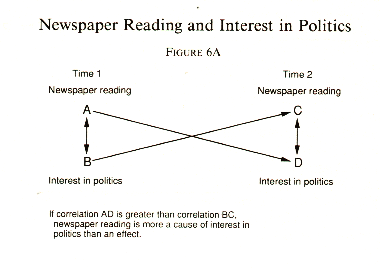
Index construction The correlation matrix can also guide you in the construction of indices out of several variables. If you think that several questionnaire items all tap a common characteristic, such as disposition toward violence, dissatisfaction with local government services, or racial prejudice, then you can get a quick estimate of their validity as an index by seeing whether they intercorrelate. How do you tell what items are suitable for an index? You want them to have low intercorrelations, in the neighborhood of .2 to .5. If the intercorrelations are too high, the items are redundant, measuring too much the same thing. If they are too low, they are measuring different things. There are several statistical tests to guide you in building indices. Chronbach's Alpha is available in SPSS. It provides an estimate of the extent to which all of the items in an index are measuring the same underlying characteristic. How does it do this? For a direct explanation, you need a statistics test. For most purposes, it is enough to think of it as a measure of internal consistency. A low Alpha score means that you probably have an apples-and-oranges problem, i.e., the items in your index are not really measuring the same thing. The accepted interpretation of Chronbach's Alpha5 is that an alpha of .7 means that an index is good enough for exploratory research, and if it is .8 or more, you can use it in a confirmatory application.6 The same SPSS routine that produces it will also tell you how badly you need each item in the index. It looks at each one in turn and tells you how much Alpha will be reduced if the item is dropped. You would not want to bother newspaper readers with this information, but it can be good for your own peace of mind. This quick search for things that hang together can be carried a step further with a factor analysis program which combs through a correlation matrix and picks out the clusters of variables that stick together with the most mathematical precision. The logic of factor analysis assumes that your variables are surface manifestations of some underlying condition and the optimum alignment of the intercorrelated variables will show what these underlying situations are. The trouble with this particular tool is that it is so powerful that it will cause factors to surface for you whether or not they are real. So you have to look at it with a skeptical eye and ask yourself whether they make any intuitive or theoretical sense. When they do, you can use them as indices to construct variables that will usually work better than single-item indicators. An example of a case in which this procedure was successful is the 1968 Detroit study of black attitudes in the 1967 riot area. A number of items that dealt with possible courses of actions toward black achievement were intercorrelated and factor analyzed. The program called for orthogonal factors to be extracted ña shorthand way of saying that the items within each factor should correlate with another in that factor but that the separate factors should not be intercorrelated. Thus each factor represents a separate dimension unrelated to the others. In the Detroit study, the first two factors extracted made good sense. The first was labeled "black power," and its strongest components were positive responses to statements such as "blacks should get more political power by voting together to get officials who will look out for the Negro people" and "blacks should get more economic power by developing strong businesses and industries that are controlled by blacks." The second factor was labeled "black nationalism." (The computer, it should be noted, does not invent these labels. You have to do it yourself.) Its strongest components included agreement with statements such as "It is very important for blacks to avoid having anything to do with white people as much as possible" and "It is very important for blacks to be ready to fight alongside other blacks and participate in riots if necessary." Finally it was shown that a sizable majority of Detroit blacks subscribed to the black power idea as defined in the conservative, self-help sense, and that very few were disposed to black nationalism. That these two dimensions were different and unrelated things was news to many whites who were accustomed to thinking of the extreme forms of militancy as differing only in degree from the black power concept. It is a difference in kind, not in degree. Although the discovery was accomplished through factor analysis, the proof did not rest on this rather intricate and difficult-to-explain tool. Indices of black power and black nationalism were constructed, collapsed into categories for contingency tables, and run against one another to verify the absence of a relationship. This step was necessary not only for simplification, but as a check against the misuse of factor analysis. For our purposes especially, it should only be used to discover clues to things that can be described in a more straightforward manner. There are other tricks that can be done with a correlation matrix. When there are several independent variables associated with the dependent variable, it is a shortcut for sorting out the effect of each by computing what is called the partial correlation coefficient. For example, in a survey of voters in Muncie, Indiana, in 1964, the correlation between political interest and income was .212, suggesting that people with money have more at stake in political decisions and therefore pay more attention to politics. On the other hand, income and education were very definitely correlated (r = .408), and there was a small but significant link between education and political interest (r = .181). Using contingency tables, it is possible to test the relationship between political interest and income by looking at it within categories of education. But that means another trip to the computing center. Partial correlation offers a quicker way to estimate the effect of holding education constant. The correlation matrix has one other special application if you have panel data. It can, sometimes, give you an easy way to spot the direction of causation. Suppose you have interviewed the same people in two projects a year apart. Each survey shows a relationship between interest in local politics and time spent reading the morning paper. The question bothering you is which comes first in the causal chain (if one does come first; it could be a case of mutual causation). Out of the correlation matrix, you find that there is a significantly stronger relationship between interest in politics at time 1 and newspaper reading at time 2 than there is between newspaper reading at time 1 and interest in politics at time 2. The predominant direction of causation, then, is from interest in politics to newspaper reading. See Figure 6A.
You may have noticed by now that you are beginning to see social science methodology in a somewhat new light. With any luck, it should begin to look like something you can do rather than just passively observe and write about. There is another corner which we have turned in this chapter. We have not, you may have noticed, made a big deal of significance testing in the discussion of survey analysis. And we have put a lot of emphasis on digging and searching procedures which don't quite square with the pure model of hypothesis testing which was presented earlier in this book. Is this, then, the point of transition from scholarship to journalism? Not exactly. The better, more creative scholars know that the search for probable cause is where the action is in survey research, and statistical testing is trivial by comparison. The tests help you guard against the temptations of overinterpretation. But analysis of tables, with the introduction of third variables to go behind the superficial, two-variable relationships, is your protection against wrong interpretation. It is also your opportunity to discover causal sequences and explanations of the way things work in your community that you didn't suspect existed before. In classical scientific method, you form a hypothesis, test it, and, if it fails the test, reject it and go on to something else. You don't keep cranking in epicycles as Ptolemy did until you have a clumsy, unparsimonious explanation to fit the observable data. Nevertheless, the rule against making interpretations after the fact, after the data are in and the printed-out tables are on your desk, is by no means ironclad. There is room in social science for serendipity. If the data give you an idea that you didn't have before, you need feel no guilt at all about pursuing it through the tables to see where it leads. Rosenberg notes that cases of serendipitous discoveries are plentiful in both the natural and the social sciences. He cites one of the best and most original concepts to emerge from modern survey research as an example: relative deprivation, uncovered by Samuel Stouffer in his research for The American Soldier.7 Stouffer did not enter this survey with the idea that there might be such a thing as relative deprivation. The idea had not occurred to him and the survey was not designed to test it. But numbers came out that were so unexpected and so surprising that it was necessary to invent the idea of relative deprivation in order to live with them. One of the unexpected findings was that Northern blacks stationed in the South, despite their resentment of local racial discrimination, were as well or even better adjusted when compared to those stationed in the North. Another discrepancy turned up in the comparative morale of soldiers in units with high promotion rates and those in units with low chances of promotion: the low-promotion group was the happiest. One parsimonious concept, relative deprivation, fit both of these situations. The black soldiers stationed in the South compared themselves to the black civilians they saw around them and found themselves better off. The high-promotion units had more soldiers who saw others being promoted and therefore felt more dissatisfaction at not getting ahead than soldiers in units where no one got ahead. When the apparent discrepancies turned up, did the analysts shout "Eureka" and appreciate their importance in the history of social science? No. Instead, they delayed the report, went over the numbers again and again, hoping that some clerical error or something would show that the black soldiers and the low-promotion soldiers were not so happy after all. There is a moral here for journalists. We are not charged with the awesome responsibility of making original scientific discovery. We do have the responsibility of challenging and testing the conventional wisdom. And if the conventional wisdom says one thing and our data say another, we should, if the data are well and truly collected and analyzed, believe our data. Rosenberg also has an answer for the methodological purists who say that after-the-fact interpretation is too much like Ptolemaic epicycle building. Accidental discoveries, he points out, are nullifiable. If you find something surprising, you can use your contingency tables to creep up on it from another direction to see if it is still there. Stouffer found something surprising in the attitude of black soldiers, invented the concept, and then tested it elsewhere in his data on the high- and low-promotion units. A journalistic example is also available. When the Knight Newspapers surveyed Berkeley arrestees five years after the arrests one of the interesting findings was that females who had been radicalized by the Sproul Hall affair tended to hold on to that radicalization more than did males in the ensuing years. This finding, based on one table, led to the hypothesis that for a girl to become a radical involves a more traumatic separation from the values and attitudes of her family than it does for a male, and that she therefore holds on to the radical movement as a family substitute. The theory was testable from other data in the survey. If it were true, females should have a greater proportion of parents who disapproved of the activity that led to their getting arrested. Furthermore, those females with disapproving parents should be more likely to retain their radicalism. Checking these two propositions required a new two-way table (sex by parent approval) and a three-way table (radical retention by parental approval by sex) and one trip to the computing center. It turned out that there was a small sex difference (though not statistically significant) in favor of males having parental approval. However, the effect of disapproving parents on radical retention was the same for boys and girls. So the theory was, for the purposes of this project at least, nullified. "The post-factum interpretation," says Rosenberg, "is thus not the completion of the analysis but only the first step in it. The interpretation is made conditional upon the presence of other evidence to support it."8 Thus
it is not necessary to fall back on a journalistic excuse for using the
computer as a searching device instead of a hypothesis-testing tool. The
journalistic excuse would be that we are in too much of a hurry to be as
precise as sociologists, and, besides, our findings are not going to be
engraved on tablets of stone. Let us think twice before copping out like
that. If we were really backed up against the wall in a methodological
argument with scientific purists, we might have to take that last-resort
position. Meanwhile, we can make the better argument that we are practical
people, just as most sociologists are practical people, and therefore,
when we spot the germ of an idea glimmering in our data, we need not shrink
from its hot pursuit.
Notes 1. Morris Rosenberg, The Logic of Survey Analysis (New York: Basic Books, 1968). return to text 2. Ibid. return to text 3. Ibid., p. 139. return to text 4. Paul Lazarsfeld, Daedalus 87:4 (1958). return to text 5. L. J. Cronbach, "Coefficient Alpha and the Internal Structure of Tests," Psychometrika, 16 (1951), 297. return to text 6. Jum C. Nunnally, Psychometric Theory (New York: McGraw-Hill, 1967), p. 276. return to text 7. Samuel A. Stouffer et al., The American Soldier: Adjustment During Army Life (Princeton: Princeton University Press, 1949). return to text 8. Rosenberg, The Logic of Survey Analysis, p. 234. return to text |
||||||||||||||||||||||||||||||||||||||||||||||||||||||||||||||||||||||||||||||||||||||||||||||||||||||||||||||||||||||||||||||||||||||||||||||||||||||||||||||||||||||||||||||||||||||||||||||||||||||||||||||||||||||||||||||||||||||||||||||||||||||||||||||||||||||||||||||||||||||||||||||||||||||||||||||||||||||||||||||||||||||||||||||||||||||||||||||||||||
Download Chapter 6 |
|||||||||||||||||||||||||||||||||||||||||||||||||||||||||||||||||||||||||||||||||||||||||||||||||||||||||||||||||||||||||||||||||||||||||||||||||||||||||||||||||||||||||||||||||||||||||||||||||||||||||||||||||||||||||||||||||||||||||||||||||||||||||||||||||||||||||||||||||||||||||||||||||||||||||||||||||||||||||||||||||||||||||||||||||||||||||||||||||||||