The New |
|||||||||||||||||||||||||||||||||||||||||||||||||||||||||||||||||||||||||||||||||||||||||||||||||||||||||||||||||||||||||||||||||||||||||||||||||||||||||||||||||||||||||||||||||||||||||||||||||||||||||||||||||||||||||||||||||||||||||||||||||||||||||||||||||||||||||||||||||||||||||||||||||||||||||||||||||||||||||||||||||||||||||||||||||||||||||||||||||||||||||||||||||||||||||||||||||||||||||||||||||||||||||||||||||||||||||||||||||||||||||||||||||||||||||||||||||||||||||||||||||||||||||||||||||||||||||||||||||||||||||||||||||||||||||||||||||||||||||||||||||||||||||||||||||||||||||||||||||||||||||||||||||||||||||||||||||||||||||||||||||||||||||||||||||||||||||||||||||||||||||||||||||||||||||||||||||||||||||||||||||||||||||||||||||||||||||||||||||||||||||||||||||||||||||||||||||||||||||||||||||||||||||||||||||||||||||||||||||||||||||||||||||||||||||||||||||||||||||||||||||||||||||||||||||||||||||||||||||||||||||||||||||||||||||||||||||||
Download Chapter 3 |
3
Harnessing the Power of Statistics It is the things that vary that interest us. Things that do not vary are inherently boring. Winter weather in Miami, Florida, may be more pleasant than winter weather in Clay Center, Kansas, but it is not as much fun to talk about. Clay Center, with its variations in wind, precipitation, and temperature, has a lot more going on in its atmosphere. Or take an extreme case of low variation. You would not get much readership for a story about the number of heads on the typical human being. Since we are all one-headed and there is no variance to ponder or explain or analyze, the quantitative analysis of number of heads per human gets dull rather quickly. Only if someone were to notice an unexpected number of two-headed persons in the population would it be interesting. Number of heads would then become a variable. On the other hand, consider human intelligence as measured by, say, the Stanford-Binet IQ test. It varies a lot, and the sources of the variation are of endless fascination. News writers and policy makers alike are always wondering how much of the variation is caused by heredity and how much by environment, whether it can be changed, and whether it correlates with such things as athletic ability, ethnic category, birth order, and other interesting variables. Variance, then, makes news. And in any statistical analysis, the first thing we generally want to know is whether the phenomenon we are studying is a variable, and, if so, how much and in what way it varies. Once we have that figured out, we are usually interested in finding the sources of the variance. Ideally, we would hope to find what causes the variance. But causation is difficult to prove, and we often must settle for discovering what correlates or covaries with the variable in which we are interested. Because causation is so tricky to establish, statisticians use some weasel words that mean almot -- but not quite -- the same thing. If two interesting phenomena covary (meaning that they vary together), they say that one depends on the other or that one explains the other. These are concepts that come close to the idea of causation but stop short of it, and rightly so. For example, how well you perform in college may depend on your entrance test scores. But the test scores are not the cause of that performance. They merely help explain it by indicating the level of underlying ability that is the cause of both test scores and college performance. Statistical applications in both journalism and science are aimed at finding causes, but so much caution is required in making claims of causation that the more modest concepts are used much more freely. Modesty is becoming, so think of statistics as a quest for the unexplained variance. It is a concept that you will become more comfortable with, and, in time, it may even seem romantic. Measuring variance There are two ways to use statistics. You can cookbook your way through, applying formulas without fully understanding why or how they work. Or you can develop an intuitive sense for what is going on. The cookbook route can be easy and fast, but to really improve your understanding, you will have to get some concepts at the intuitive level. Because the concept of variance is so basic to statistics, it is worth spending some time to get it at the intuitive level. If you see the difference between low variance (number of human heads) and high variance (human intelligence), your intuitive understanding is well started. Now let's think of some ways to measure variance. A measure has to start with a baseline. (Remember the comedian who is asked, "How is your wife?" His reply: "Compared to what?") In measuring variance, the logical "compared to what" is the central tendency, and the convenient measure of central tendency is the arithmetic average or mean. Or you could think in terms of probabilities, like a poker player, and use the expected value. Start with the simplest possible variable, one that varies across only two conditions: zero or one, white or black, present or absent, dead or alive, boy or girl. Such variables are encountered often enough in real life that statisticians have a term for them. They are called dichotomous variables. Another descriptive word for them is binary. Everything in the population being considered is either one or the other. There are two possibilities, no more. An interesting dichotomous variable in present-day American society is minority status. Policies aimed at improving the status of minorities require that each citizen be first classified as either a minority or a nonminority. (We'll skip for now the possible complications of doing that.) Now picture two towns, one in the rural Midwest and one in the rural South. The former is 2 percent minority and the latter is 40 percent minority. Which population has the greater variance? With just a little bit of reflection, you will see that the midwestern town does not have much variance in its racial makeup. It is 98 percent nonminority. The southern town has a lot more variety, and so it is relatively high in racial variance. Here is another way to think about the difference. If you knew the racial distribution in the midwestern town and had to guess the category of a random person, you would guess that the person is a nonminority, and you would have a 98 percent chance of being right. In the southern town, you would make the same guess, but would be much less certain of being right. Variance, then, is related to the concept of uncertainty. This will prove to be important later on when we consider the arithmetic of sampling. For now, what you need to know is that
A
Continuous variable
Now
to leap beyond the dichotomous case. Let's make it a big leap and consider
a variable that can have an unlimited number of divisions. Instead of just
0 or 1, it can go from 0 to infinity. Or from 0 to some finite number but
with an infinite number of divisions within the finite range. Making this
stuff up is too hard, so let's use real data: the frequency of misspelling
"minuscule" as "miniscule" in nine large and prestigious news organizations
archived in the VU/TEXT and NEXIS computer databases for the first half
of calendar 1989.
Just
by eyeballing the list, you can see a lot of variance there. The worst-spelling
paper on the list has more than ten times the rate of misspelling as the
best-spelling paper. And that method of measuring variance, taking the
ratio of the extremes, is an intuitively satisfying one. But it is a rough
measure because it does not use all of the information in the list. So
let's measure variance the way statisticians do. First they find a reference
point (a compared-to-what) by calculating the mean, which is the sum of
the values divided by the number of cases. The mean for these nine cases
is 11.6. In other words, the average newspaper on
this list gets "minuscule" wrong 11.6 percent of the time. When we talk
about variance we are really talking about variance around (or variance
from) the mean. Next, do the following:
That
is quite a long and detailed list. If this were a statistics text, you
would get an equation instead. You would like the equation even less than
the above list. Trust me.
So
do all of the above, and the result is the variance in this case. It works
out to about 100, give or take a point. (Approximations are appropriate
because the values in the table have been rounded.) But 100 what? How do
we give this number some intuitive usefulness? Well, the first thing to
remember is that variance is an absolute, not a relative concept. For it
to make intuitive sense, you need to be able to relate it to something,
and we are getting close to a way to do that. If we take the square root
of the variance (reasonable enough, because it is derived from a listing
of squared differences), we get a wonderfully useful statistic called the
standard
deviation of the mean. Or just standard deviation for short. And
the number you compare it to is the mean.
In this case, the mean is 11.6 and the standard deviation is 10, which means that there is a lot of variation around that mean. In a large population whose values follow the classic bell-shaped normal distribution, two-thirds of all the cases will fall within one standard deviation of the mean. So if the standard deviation is a small value relative to the value of the mean, it means that variance is small, i.e., most of the cases are clumped tightly around the mean. If the standard deviation is a large value relative to the mean, then the variance is relatively large. In the case at hand, variation in the rate of misspelling of "minuscule," the variance is quite large with only one case anywhere close to the mean. The cases on either side of it are at half the mean and double the mean. Now that's variance! For contrast, let us consider the circulation size of each of these same newspapers.1
The mean circulation for this group of nine is 708,678 and the standard deviation around that mean is 238,174. So here we have relatively less variance. In a large number of normally distributed cases like these, two-thirds would lie fairly close to the mean -- within a third of the mean's value. One way to get a good picture of the shape of a distribution, including the amount of variance, is with a graph called a histogram. Let's start with a mental picture. Intelligence, as measured with standard IQ tests, has a mean of 100 and a standard deviation of 16. So imagine a Kansas wheat field with the stubble burned off, ready for plowing, on which thousands of IQ-tested Kansans have assembled. Each of these Kansans knows his or her IQ score, and there is a straight line on the field marked with numbers at one-meter intervals from 0 to 200. At the sounding of a trumpet, each Kansan obligingly lines up facing the marker indicating his or her IQ. Look at Figure 3A. A living histogram! Because IQ is normally distributed, the longest line will be at the 100 marker, and the length of the lines will taper gradually toward the extremes.
Some
of the lines have been left out to make the histogram easier to draw. If
you were to fly over that field in a blimp at high altitude, you might
not notice the lines at all. You would just see a
curved shape as in Figure 3B. This curve is defined by a series of distinct
lines, but statisticians prefer to think of it as a smooth curve, which
is okay with us. We don't notice the little steps from one line of people
to the next, just as we don't notice the dots in a halftone engraving.
But now you see the logic of the standard deviation. By measuring outward in both directions from the mean with the standard deviation as your unit of measurement, you can define a specific area of the space under the curve. Just draw two perpendiculars from the baseline to the curve. If those perpendiculars are each one standard deviation -- 16 IQ points -- from the mean, you will have counted off two-thirds of the people in the wheat field. Two-thirds of the population has an IQ between 84 and 116. For that matter, you could go out about two standard deviations (1.96 if you want to be precise) and know that you had included 95 percent of the people, for 95 percent of the population has an IQ between 68 and 132. Figures
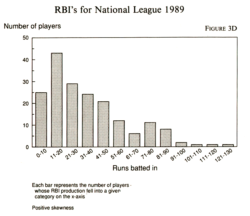
3C and 3D are histograms based on real data.
When you are investigating a body of data for the first time, the first thing you are going to want is a general picture in your head of its distribution. Does it look like the normal curve? Or does it have two bumps instead of one -- meaning that it is bimodal? Is the bump about in the center, or does it lean in one direction with a long tail running off in the other direction? The tail indicates skewness and suggests that using the mean to summarize that particular set of data carries the risk of being overly influenced by those extreme cases in the tail. A statistical innovator named John Tukey has invented a way of sizing up a data set by hand.2 You can do it on the back of an old envelope in one of the dusty attics where interesting records are sometimes kept. Let's try it out on the spelling data cited above, but this time with 38 newspapers. Spelling Error Rates: Newspapers Sorted by Frequency of Misspelling "Minuscule"
Tukey
calls his organizing scheme a stem-and-leaf chart. The stem shows,
in shorthand form, the data categories arranged along a vertical line.
An appropriate stem for these data would set the categories at 0 to 9,
representing, in groups of 10 percentage points, the misspell rate for
"minuscule." The result looks like this:
The
first line holds values from 0 to 9, the second from 11 to 16, etc. The
stem-and-leaf chart is really a histogram that preserves the original values,
rounded here to the nearest full percentage point. It tells us something
that was not obvious from eyeballing the alphabetical list. Most papers
are pretty good at spelling. The distribution is not normal, and it is
skewed by a few extremely poor spellers. Both the interested scientist
and the interested journalist would quickly want to investigate the extreme
cases and find what made them that way. The paper that misspelled "minuscule"
86 percent of the time, the Annapolis Capital, had no spell-checker
in its computer editing system at the time these data were collected (although
one was on order).
Here
is another example. The following numbers represent the circulation figures
of the same newspapers in thousands: 221, 76, 119, 244, 272, 315, 416,
1116, 193, 503, 231, 769, 509 372, 24, 136, 120, 275, 1039, 145, 255, 156,
237, 716, 171, 681, 462, 190, 254, 235, 629, 140, 56, 318, 345, 106, 136,
42. See the pattern there? Not likely. But put them into
a stem-and-leaf chart and you see that what you have is a distribution
skewed to the high side.
Here's
how to read it. The numbers on the leaf part (right of the vertical line)
have been rounded to the second significant figure of the circulation number
--
or tens of thousands in this case. The number on the
stem is the first figure. Thus the circulation figures in the first row
are 20,000, 40,000, 60,000 and 80,000. In the second row, we have 120,000,
190,000, 140,000 and so on. Toward the bottom of the stem, we run into
the millions, and so a 1 has been added to the left of the stem to signify
that the digit is added here. These represent rounded circulation figures
of 1,040,000 (The New York Times) and 1,120,000 (the Los Angeles
Times) respectively.
Notice
that in our first example, the misspelling rate for "minuscule," we started
with a list that had already been sorted, and so the values on each leaf
were in ascending order. In the second case, we were dealing with a random
assortment of numbers more like the arrays you will encounter in real life.
The stem-and-leaf puts them in enough order so that you can very quickly
calculate the median if you want. Just pencil in another column of numbers
that accumulates the cases row by row.
Because
there are 38 observations, the median will lie between the 19th and 20th.
The 19th case would be the fourth highest in the row representing the 200,000
range. By inspection (which is what mathematicians say when they can see
the answer just by looking at the problem), we see that the 19th and 20th
cases are both 240,000. So the median circulation size in our sample is
240,000.
Central tendency What we have seen so far are various ways of thinking about variance, the source of all news. And we have demonstrated that variance is easier to fathom if we can anchor it to something. The notion of variance implies variance from something or around it. It could be variance from some fixed reference point. In sports statistics, particularly in track and field, a popular reference point is the world record or some other point at the end of some historic range (e.g., the conference record or the school record). In most statistics applications, however, the most convenient reference point is neither fixed nor extreme. It is simply a measure of central tendency. We have mentioned the three common measures already, but now is a good time to summarize and compare them. They are:
The
mode is simply the most frequent value. Consulting the stem-and-leaf chart
for the misspelling of "minuscule," we find that the modal category is
0-9 or a misspelling rate of less than 10 percent. Headline writers and
people in ordinary conversation both tend to confuse the mode with the
majority. But it is not true that "most" newspapers on the list have error
rates of less than 10 percent. While those with the low error rates are
in the biggest category, they are nevertheless a minority. So how would
you explain it to a friend or in a headline? Call it "the most frequent
category."
The mean is the most popular measure of central tendency. Its popular name is "average." It is the value that would yield the same overall total if every case or observation had the same value. The mean error rate on "minuscule" for the 38 newspapers is 18 percent. The mean is an intuitively satisfying measure of central tendency because of its "all-things-being-equal" quality. If the overall number of misspellings of "minuscule" remained unchanged but if each newspaper had the same error rate, that rate would be 18 percent.3 There are, however, situations where the mean can be misleading: situations where a few cases or even one case is wildly different from the rest. When USA Today interviewed all 51 finalists in the 1989 Miss America competition, its researchers asked the candidates how many other pageants they had been involved in on the road to Atlantic City. The mean was a surprisingly high 9.7, but it was affected by one extreme case. One beauty had spent a good portion of her adult life in the pageant business and guessed she had participated in about 150 of them. So the median was a more typical value for this collection of observations. It turned out to be 5.4 Median is frequently used for the typical value when reporting on income trends. Income in almost any large population tends to be severely skewed to the high side because a billionaire or two can make the mean wildly unrepresentative. The same is true of many other things measured in money, including home values. The median is defined as the value of the middle case. If you have an even number of cases, as in our 38-newspaper example, the usual convention is to take the point midway between the two middle cases. And the usual way of describing the median is to say that it is the point at which half the cases fall above and half are below. If you have ties -- some cases with the same value as the middle case -- then that statement is not literally true, but it is close enough. To recapitulate: the interesting things in life are those that vary. When we have a series of observations of something that interests us, we care about the following questions:
Now we get to the fun part. The examples of hypothesis testing in the previous chapter all involved the relationship of one variable to another. If two things vary together, i.e., if one changes whenever the other changes, then something is connecting them. That something is usually causation. Either one variable is the cause of changes in the other, or the two are both affected by some third variable. Many issues in social policy turn on assumptions about causation. If something in society is wrong or not working, it helps to know the cause before you try to fix it. The
first step in proving causation is to show a relationship or a covariance.
The table from the previous chapter in which we compared the riot behavior
of northerners and southerners living in Detroit is an example.
It
does not take a lot of statistical sophistication to see that there is
an association between being brought up in the North and participation
in the riot. The table does not tell all that is worth knowing about riot
behavior, but it provides some grounding in data for whatever possibilities
you might choose to explore.
Let
us examine some of the characteristics of this table that make it so easy
to understand. Its most important characteristic is that the percents are
based on the variable that most closely resembles a potential cause of
the other. The things that happen to you where you are brought up might
cause riot behavior. But your riot behavior, since it occurs later in time,
can't be the cause of where you were brought up. To demonstrate what an
advantage this way of percentaging is, here is the same table with the
percentages based on row totals instead of column totals:
This
table has as much information as the previous one, but your eye has to
hunt around for the relevant comparison. It is found across the rows of
either column. Try the first column. Fifty-nine percent of the non-rioters,
but only 27 percent of the rioters, were raised in the South. If you stare
at the table long enough and think about it earnestly enough, it will be
just as convincing as the first table. But thinking about it is harder
work because the percentage comparisons are based on the presumed effect,
not the cause. Your thought process has to wiggle a little bit to get the
drift. So remember the First Law of Cross-tabulation:
And
what is the independent variable? "Independent" is one of those slippery
words discussed earlier that helps us avoid leaping
to an assumption about causation. If one of these variables is a cause
of the other, it is the independent variable. The presumed effect
is the dependent variable. You can make all of this easy for yourself
if you always construct your tables -- whether it is on the back of an
envelope or with a sophisticated computer program -- so that the independent
variable is in the columns (the parts of the table that go up and down)
and the dependent variable is in the rows (the parts of the table that
go from side to side).
If
you can do that, and if you can remember to always percentage so that the
percents add up to 100 in the columns, your ability to deal with numbers
will take a great leap forward. Just make your comparisons across the rows
of the table. My years in the classroom have taught me that journalism
students who have mastered this simple concept of statistics make good
progress. So it is worth dwelling on. For practice, look at the now-familiar
Detroit riot table.
If
we want to know what might cause rioting -- and we do -- the relevant comparison
is between the numbers that show the rioting rates for the two categories
of the independent variable, the northerners and southerners. The latter's
rate is 8 percent and the former's is 25 percent, a threefold difference.
Just looking at those two numbers and seeing that one is a lot bigger than
the other tells you a lot of what you need to know.
Here
are some comparisons not to make (and I have seen their like often,
in student papers and in the print media):
Bad comparison No. 1: "Eight percent of the southerners rioted, compared to 92 percent who did not." That's redundant. If eight percent did and there are only two categories, then you are wasting your publication's ink and your reader's time by spelling out the fact that 92 percent did not riot. Bad comparison No. 2: "Eight percent of the southerners rioted, compared to 75 percent of the northerners who did not riot." Talk about apples and oranges! Some writers think that numbers are so boring that they have to jump around a table to liven things up, hence the comparison across the diagonal. That it makes no sense at all is something they seem not to notice. Finally, pay attention to and note in your verbal description of the table the exact nature of the percentage base. Some people who write about percentages appear to think that the base doesn't matter. Such writers assume that saying that 8 percent of the southerners rioted is the same as saying 8 percent of the rioters were from the South. It isn't! If you are not convinced of this look at the table with the raw numbers that follows in the next section. But first, one more example to nail the point down. Victor Cohn, in an excellent book on statistics for journalists, cites a report from a county in California that widows were 15 percent of all their suicides and widowers only 5 percent. This difference led someone to conclude that males tolerate loss of marital partners better than females do. The conclusion was wrong. Widows did more of everything, just because there were so many of them. What we really want to know is the rate of suicide among the two groups, and that requires basing the percent on the gender of the surviving spouse, not on all suicides. It turns out that females were the hardier survivors, because .4 percent of the widows and .6 percent of the widowers were suicides.5 Drawing inferences When an interesting relationship is found, the first question is "What hypothesis does it support?" If it turns out to support an interesting hypothesis, the next question is "What are the rival hypotheses?" The obvious and ever-present rival hypothesis is that the difference that fascinates us and bears out our hunch is nothing but a coincidence, a statistical accident, the laws of chance playing games with us. The northerners in our sample were three times as likely to riot as the southerners? So what? Maybe if we took another sample the relationship would be reversed. There is a way to answer this question. You will never get an absolute answer, but you can get a relative answer that is pretty good. The way to do it is to measure just how big a coincidence it would have to be if indeed coincidence is what it is. In other words, how likely is it that we would get such a preponderance of northern rioting over southern rioting by chance alone if in fact the two groups were equal in their riot propensity? And the exact probability of getting a difference that peculiar can be calculated. Usually, however, it is estimated through something called the chi-square distribution, discovered by an Englishman named Carl Fisher who applied it to experiments in agriculture. To understand its logic, we are going to look at the Detroit table one more time. This time, instead of percents, we shall put the actual number of cases in each cell.
The
two sets of totals, for the columns and the rows, are called marginals,
because that's where you find them. The question posed by Fisher's chi-square
(c2) test is this: Given the
marginal values, how many different ways can the distributions in the four
cells vary, and what proportion of those variations is at least as unbalanced
as the one we found?
That
is one way to ask the question. Here is another that might be easier to
understand. If the marginals are given and the cell values are random variations,
we can calculate the probable or mathematically expected value for
each of the cells. Just multiply the row total for each cell by its column
total and divide the result by the total number of cases. For the southern
rioters, for example, in the upper left corner, the expected value is (237
* 70)/437 = 38. That expected value is considerably different from the
observed value of 19.
By
finding the differences between your observed values and the expected values
derived from the chi-square test, you can figure out just how goofy and
unexpected your table is. You need two things: the formula for calculating
the chi-square value, and Fisher's table that gives the probability of
getting a value that high. (If you have a computer and a good statistical
package, you don't need either, but that's another chapter.) It is good
to be able to calculate a chi-square by hand. Here is the short formula
for doing it with a two-by-two table with cells A, B, C, and D:
The formula is not as difficult as it looks. All it says is that you multiply the diagonals of the table, subtract one result from the other, square the outcome and multiply by the total number of cases in the table. Then divide by each of the values in the margins of the table. Here's what happens when you apply it to the Detroit table above: 51 times 218 is 11,118 and 19 times 149 is 2,831. Subtract one product from the other, and you get 8,287. The square of 8,287 is 68,674,369. Multiplying that by the total number of cases in the table, 437, produces a big, hairy number: 30,010,699,253. That number is so big that your standard four-function calculator can't handle it. A better calculator that uses scientific notation might show it as 3.0011 10, meaning that the decimal point belongs ten places to the right and that precision in the last few digits is not available in your calculator's display. No problem. The next step in your formula makes the number smaller. Just divide that number by each of the marginals in turn. First divide by 200, divide the result by 237, that result by 367 and so on. The end result rounds off to a chi-square value of 24.6. In
a two-by-two table, the chi-square values needed for different levels of
probability are as follows:
Since
the chi-square in the Detroit table is greater than 10.827, the likelihood
that the difference between northern and southern riot behavior was a chance
aberration is less than one in a thousand. It now becomes a case of which
you find easier to believe: that something about being from the North makes
a person more likely to participate in the riot, or that a greater than
a thousand-to-one long-shot coincidence occurred.
That
is really all chi-square is good for: comparing what you have to what pure
chance would have produced. If coincidence is a viable explanation, and
it often will be, then in evaluating that explanation it helps to know
how big a coincidence it takes to produce the sort of thing you found.
The chi-square test is that evaluation tool.
In the statistical literature, there has been a debate over whether chi-square applies to all situations where coincidence is an alternative explanation or just to those where sample data are involved. Some social scientists say the test measures nothing but sampling error, the random deviation of a sample from the population out of which it was drawn. If your study covers every case in an entire population, you don't need a chi-square or similar test, they argue. But in both journalistic and social science applications there will be situations where you will look at an entire population and still be concerned about the chance factor as one way to account for the peculiar things you find. For example, you might examine the academic records of all the NCAA Division I basketball players for a given year and compare the graduation rates of these athletes at different schools. If some schools have higher or lower graduation rates, one explanation is that there is a lot of variation in graduation rates and the differences are just due to the random patterns of that particular year. The chi-square test lets you compare the distribution you found to a chance distribution. Of course, even this case involves a sample of sorts, because when you look at the record for a year you are probably going to draw inferences about the way different schools manage their basketball programs and you are projecting to past years and maybe even to future years. You might even think of your one-year data set as a sample of an infinite universe of all possible years and all possible Division I schools. The bottom line for journalistic applications: whenever you have a situation where someone is likely to challenge your results by claiming coincidence, use chi-square or a related test to find out how big a coincidence it takes to explain what you have. Chi-square belongs to a large family of statistical tests called significance tests. All yield a significance level which is just the probability of getting, by chance alone, a difference of the magnitude you found. Therefore, the lower the probability, the greater the significance level. If p = .05, it means the distribution is the sort that chance could produce in five cases out of 100. If you are planning to base a lead on your hypothesis and want to find significance, then the smaller the probability number the better. (A big coincidence is an event with a low probability of happening.) In addition to chi-square, there is one other significance test you are likely to need sooner or later. It is a test for comparing the differences between two means. It is called Students t, or the t-test for short. There are two basic forms: one for comparing the means of two groups (independent samples) and one for comparing the means of two variables in the same group (paired samples). This test is not as easy to calculate by hand as chi-square . If you want to learn how, consult a statistics text. All the good statistical packages for computers have t-tests as standard offerings. One final point about significance tests: Low probability (i.e., high significance) is not always the same thing as important. Low probability events are, paradoxically, quite commonplace, especially if you define them after the fact. Here is a thought experiment. Make a list of the first five people you passed on the street or the campus or the most recent public place where you walked. Now think back to where you were one year ago today. Projecting ahead a year, what would have been the probability that all the random events in the lives of those five people would have brought them into your line of vision in that particular order on this particular day? Quite remote, of course. But it doesn't mean anything, because there was nothing to predict it. Now suppose you had met a psychic with a crystal ball, and she had written the names of those five people on a piece of paper, sealed it in an envelope, and given you the envelope to open one year later. If you did and her prediction proved to be true, that would have led you to search for explanations other than coincidence. That's what statistical significance does for you. When unusual events happen it is not their unusualness alone that makes them important. It is how they fit into a larger picture as part of a theoretical model that gives them importance. Remember Rick (played by Humphrey Bogart) in the film Casablanca when he pounds the table? "Of all the gin joints in all the towns in all the world, she walks into mine," laments Rick. The coincidence is important only because he and the woman who walked in had a history with unresolved conflict. Her appearance fit into a larger pattern. Most improbable events are meaningless because they don't fit into a larger pattern. One way to test for the fit of an unusual event in a larger pattern is by using it to test a theory's predictive power. In science and in journalism, one looks for the fit. Continuous variables You have noticed by now that we have been dealing with two different ways of measuring variables. In the Detroit riot table, we measured by classifying people into discrete categories: northerner or southerner, rioter or non-rioter. But when we measured the error rate for "minuscule" at 38 different newspapers, the measure was a continuum, ranging from zero (the Akron Beacon Journal) to 86 percent (the Annapolis Capital). Most statistics textbooks suggest four or five kinds of measurement, but the basic distinction is between categorical and continuous. There is one kind that is a hybrid of the two. It is called ordinal measurement. If you can put the things you are measuring in some kind of rank order without knowing the exact value of the continuous variable on which you are ordering them, you have something that gives more information than a categorical measure but less than a continuous one. In fact, you can order the ways of measuring things by the amount of information they involve. From lowest to highest, they are: Categorical (also called nominal) Ordinal (ranking) Continuous (also called interval unless it has a zero point to anchor it, in which case it is called ratio). Categorical measures are the most convenient for journalism because they are easiest to explain. But the others are often useful because of the additional information about relative magnitude that they contain. When collecting data, it is often a good idea to try for the most information that you can reasonably get. You can always downgrade it in the analysis. In the Detroit case, we used categorical measures to show how two conditions, northernness and rioting, occur together more often than can readily be explained by chance. If the rioters in Detroit had been measured by how many hours and minutes they spent rioting, a nice continuous measure of intensity would have resulted. And that measure could easily have been converted to an ordinal or categorical measure just by setting cutting points for classification purposes. The Detroit data collection did not do that, however, and there is no way to move in the other direction and convert a categorical measure to a continuous one because that would require additional information that the categorical measure does not pick up. Continuous measures are very good for doing what we set out to do in this section, and that is see how two variables vary together. When you have continuous measurement, you can make more powerful comparisons by finding out whether one thing varies in a given direction and --here's the good part -- to a given degree when the other thing varies. Time for an example. When USA Today was getting ready to cover the release of 1990 census data, the special projects team acquired a computer file of 1980 census data for Wyoming. This state was chosen because it is small, easy for the census bureau to enumerate, and usually first out of the chute when census data are released. So USA Today used Wyoming to shake down its analysis procedures. Because the census uses geographic areas as its basic units of analysis, virtually all of its data are continuous. A county has so many blacks, so many farmers, so many persons of Irish ancestry under the age of 5 and on and on. Here are two continuous measures of counties in Wyoming: one is the percent of single-person household members who are female; the other is the percent of persons living in the same house they lived in five years earlier. These variables are treated in the database as characteristics of counties, not of people, so let's give them names that will help us remember that: Dependent variable: Single-Female Rate. Defined as the number out of every 100 people living alone who are female. Independent variable: Stability Rate. Defined as the number out of every 100 persons who lived at the same address five years earlier. If
single females are less mobile than single males, then these two variables
might be related. In other words, we might expect that counties were the
single people are mostly female would be more stable
than counties where the single people are more likely to be males. We shall
now explore some different ways of checking that possibility.
Is
there an association between these two variables? One way to find out is
to take a piece of graph paper and plot each county's position so that
female ratio is on the vertical axis and percent in same house is on the
horizontal axis. Then you can see if the counties arrayed by these variables
form some kind of a pattern. And they do! The plot is in Fig. 3E.
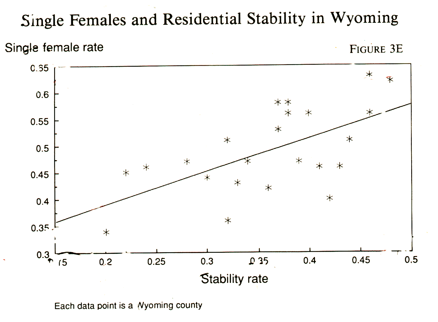 They tend to cluster around an imaginary diagonal line running upward from left to right. Just by inspection, you can see enough of a relationship to justify saying something like this: in general, among Wyoming counties the greater the proportion of females in single-person households, the higher the proportion of people who have lived in the same house for five years. The fact that the points on the plot cluster around a straight line shows that the general linear model can be applied here. The general linear model (GLM) is a way of describing a great many kinds of interconnectedness in data. Its basic statistic is the correlation coefficient. Read a statistics text if you want to know how to do one by hand. A good pocket calculator (with a statistics function) or a computer is easier.6 Here is what you need to know about the correlation coefficient: Its range is from -1 to 1. The farther it gets from zero, the greater the correlation, i.e., the closer the points on the plot are to a straight line. In a negative correlation the line slants down from left to right: the X variable (horizontal axis) gets smaller when the Y variable (vertical) gets bigger. In a positive correlation the line slants up: the two variables get bigger together. Correlation is a rather precise expression of covariance or the ability of one variable to predict or explain another. (These are the weasel words we use to keep from claiming causation, remember?) The square of the correlation coefficient gives you the amount of variance in one variable that is statistically accounted for or "explained" by variance in the other. Let's make this less abstract. Look at the plot in Figure 3E again. The correlation between the two variables is .613. (At 1.0 the dots would form a perfect straight line). And .613 times .613 is .38. Thus, the variance explained (the correlation coefficient squared) is 38 percent. So 38 percent in the variation in home stability is explained by the variation in the rate of female single-person households. What about the rest of the variance? Much of it might be explained by other things that could be measured. You will never get all of it because some of the variance is due to measurement error. Explaining 38 percent of the variance may not sound like much, but in social science, anybody who can explain as much as 10 percent (a correlation of .333) usually feels pretty good about it. This concept of variance explained is so important that you need to have an intuitive sense of its meaning. Here is another way to think about it. The correlation coefficient comes with an equation that describes the straight line. The general form of the equation is Y = C + BX. The particular equation in this case is Y = .27 + .62X. It means that for every 1 percent increase in the percent who have lived in the same house for five years there is, on average, a .62 percent increase in the rate of single-person female households. (The .27 is the regression constant. It is what Y is worth when X = 0. In other words, it is where the graph starts on the Y axis.) You see statements like this in newspapers all the time, usually when economists are being quoted. For every Y increase in the unemployment rate, they say, retail sales decrease by X percent. There is a correlation and a regression equation behind that statement. Such statements have all kinds of uses because they enable a prediction to be made about one variable when the value of the other variable is known. When we talk about "variance explained," we're talking about making a good prediction. To get a better grip on this idea, let's look at our Wyoming data again. If you had to guess the value of either variable for a random county in Wyoming about which you knew nothing, it would help if you knew something about patterns in the state as a whole. Knowing the mean value for the variable would help, for example. You could minimize your error just by guessing the mean, because a randomly chosen county has a good chance of being pretty close to the mean. If you also had the regression equation and the value of the other variable, you could improve the accuracy of your guess even more. How much more? Thirty-three percent more. Where does the 33 come from? The square of the correlation coefficient is the variance explained. Quite literally, you remove 33 percent of the error that you would make if you tried to guess all the values on the basis of the mean. And if the correlation were 1.00, you would remove 100 percent of the error and be right every time. (The square of 1 is 1.) A word or two about substance. Why should the proportion of females in single-person households predict the rate of staying put for five years? Does one cause the other? Probably not directly. Women live longer than men. Older people are less mobile. So counties with older people have more single women because the men have died off, and the surviving females are in a stage of life where they don't move much. You could check on this by collecting data on the age of the population in each county and then holding the age factor constant with a partial correlation -- something a computer can easily do but which you are better off learning from a statistics text. There is one other nice thing about the correlation coefficient. It comes with its own significance test. And it is a more sensitive test than chi-square because it uses more data. It looks at the closeness of fit in the plot to the straight-line model and asks, "Out of all the ways of distributing the dots on the plot, how many would be that close or closer to a straight line?" Durn few, it turns out in the Wyoming case. The significance level of the correlation coefficient is .002, meaning that if the association between the variables is accidental, it is a one-in-five-hundred accident or a pretty improbable one. This
case illustrates the value of having interval data, because when we cut
back to categorical data and run a chi-square test, the significance goes
away. However, the categorical comparison is often easier to explain to newspaper
readers. How do we change it to categorical data? Find the approximate
midpoint for each variable and divide the cases into two categories, high
and low.
What
we have done here is classify each of the 23 Wyoming counties into one
of four categories: high on stability and single-female rate, low on both,
high on the first and low on the second, and the reverse. In other
words, we have reduced continuous variables to categorical variables and
cross-classified the 23 cases according to these categories.
Does
it show anything interesting? What it shows becomes more apparent if we
convert the number of cases in each cell to a percent, using the column
total as the base. Here's what that looks like:
This
tables shows a big difference. The counties with a low rate of single-female
households are much more likely to experience low residential stability
than those with a high rate of single-female households, by 64 to 42 percent.
That's a difference of 22 percentage points.
While
possibly important, that difference is not statistically significant. The
number of cases in the cells is only 7, 4, 5, and 7. The chi-square value
is only 1.1, far less than needed for statistical significance. Worse yet,
chi-square starts to give freaky results when cell sizes dip below 5. How
can the relationship be significant by one test and not by another? Because
we threw away the information that made it significant when we went from
a continuous measure to a categorical one. Moral: when you want to prove
a point with a small sample, it helps to have continuous measurement. Even
when you end up reporting only the categorical comparison, you may, for
your own peace of mind, want to look at the interval-level significance
test to be sure that you have something worth reporting.
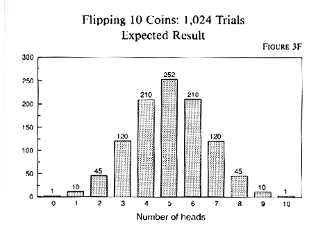
Sampling Everybody samples. Your editor looks out the window, sees a lot of women in miniskirts and commissions the style section to do a piece on the return of the miniskirt. You buy a Toyota and suddenly you notice when you drive down the street that every other car you pass is a Toyota. Their ubiquity had escaped your notice before, and you hadn't realized what a conformist you were turning out to be. All of us extrapolate from what we see to what is unseen. Such sampling might be termed accidental sampling. If the results are generalizable, it is an accident. Scientific method needs something better. Unfortunately, there is no known way to produce a sample with certainty that the sample is just like the real world. But there is a way to sample with a known risk of error of a given magnitude. It is based on probability theory, and it is called probability sampling. Try an experiment. It requires ten pennies. You can do it as a thought experiment or you can actually get ten pennies, find a cup to shake them in, and toss them onto a flat surface so that each penny has an even chance of landing with the head facing up. That is a sample. Of what? It is a sample of all of the possible coin flips in the universe through all of recorded and unrecorded time, both past and future. In that theoretical universe of theoretical flips of unbiased coins, what is the ratio of heads to tails? Of course: 50-50. When you flip just ten coins you are testing to see how much and how often a sample of ten will deviate from that true ratio of 50-50. The "right" answer is five heads and five tails. (That's redundant. For the rest of this discussion, we'll refer only to the number of heads since the number of tails has to be, by the definition of the experiment, equal to ten minus the number of heads.) So go ahead, try it. Are you going to get exactly five heads on the first throw? Probably not. While that outcome is more probable than any other definite number of heads, it is not more probable than all the other possibilities put together. Probability
theory can tell us what to expect. There are exactly 1,024 ways to flip
ten coins. (To understand why, you'll have to find a basic statistics text.
But here is a hint: the first coin has two possibilities, heads and tails.
For each of those, the second coin creates two more possible patterns.
And so it goes until you have multiplied two times itself ten times. Two
to the tenth power is 1,024.) Of those finite possibilities or permutations,
only one contains ten heads and only one contains zero heads. So those
two probabilities are each 1/1024 or, in decimals, .00098. The other outcomes
are more probable because there are more ways to get them. A total of one
head can happen in ten different ways (first toss, second toss, etc.).
A total of two can happen in 45 different ways. Here is chart to show the
expected outcome of 1,024 flips of ten coins (Figure 3F provides a histogram
to help you visualize it):
If you think of each toss of ten coins as a sample, you can see how sampling works. The chances of your being badly misled by a sample of only ten are not too great. But the best part is that the risk is knowable. Figure this out: what is the risk that your sample of ten would be more than 20 percentage points off the "true" value? The true value in our imaginary universe of all coin flips is 50 percent heads. Allowing for a 20-point deviation in either direction gives us a range of 30 to 70 either way. And if you add up the expected outcomes in the 1,024 possible, you find that only 102 of them (56 in each tail of the distribution) are outside the 30-to-70 range. So you can be 90 percent certain that your first toss -- or any given toss -- will yield from 3 to 7 heads. In other words, it will be within 20 percentage points of being exactly representative of the total universe. That is a pretty important concept, and to let it soak in, you might want to flip ten coins a few times and try it. Or if you are using this book in a class, get the whole class to do it and track a hundred or so tries on the blackboard. The distribution will gradually start to look like the histogram in Figure 3F, and it will help you convince yourself that there is some reality to these hypothetical probabilities. Now consider what we can do with it. Two important tools have just been handed to you:
The
first is called sampling error.
The
second is called confidence level.
Here's the good part: you can choose whatever sampling error you want to work with and calculate its confidence level. We did that with the coin flips: we set the sampling error at 20 percentage points and found out by looking at the sampling distribution that the confidence level was 90 percent. Alternatively -- and this happens more often in everyday life --you can set the confidence level you are comfortable with and then calculate an error margin to fit it. To do that, you have to have an equation. Here is an example. This is the equation for calculating the error margin at the 67 percent level of confidence: E = sqrt (.25/n) The n in the formula is the sample size. That .25 in the parenthesis represents the variance in the coin-flipping case or, for that matter, in any case where the real-world distribution is 50-50 -- a close election with two candidates, for example. The shortcut formula for variance in any situation where there are just two possible outcomes (heads or tails, Republican or Democrat, boy or girl) is p * q where p is the probability of getting one outcome and q is the probability of the other. The sum of p and q has to be 1, so q is defined as 1-p. The formula for sampling error uses .25 to be conservative. That's the maximum variance in the two-outcome situation. If the split were 60-40 instead of 50-50, the variance would be .24. If it were 90-10, the variance would be .09. To see that the formula makes intuitive sense, try it out for a sample of one. Sound crazy? Sure. If you tried to generalize to the universe of all possible coin flips from just one trial, you couldn't possibly get it right. And the formula lets you know that. Work it out. It gives you a sampling error of .5, or plus or minus 50 percentage points, which pretty much covers the ball park. Now try it for a sample of 100. Sampling error is now plus or minus five percentage points, which is a lot better. In most sampling situations, we are not content with a confidence level of 67 percent. The formula gives the sampling error for that confidence level because it covers one standard error around the true value. Standard error is like the concept of standard deviation around the mean in a population. When dealing with a sample, it makes sense to call it standard error because the reference point is an exact (although often unknown) real-world value rather than the foggier concept of central tendency. Remember the example of the Kansans in the wheat field? And how one standard deviation in each direction from the mean of a population covers two-thirds of the cases in a normal distribution? In a sample distribution, something similar happens. One standard error in each direction covers two-thirds of the expected samples. If you flipped coins in groups of 100, two-thirds of the groups would yield an error of no more than 5 percentage points: that is, they would turn up between 45 and 55 heads. In real life, one usually deals with one sample at a time, and so it is easier to think in terms of probabilities. In a sample of 100, the probability is 67 percent that the error is within plus or minus 5 percentage points. Suppose 67 percent isn't enough confidence? If you kept that as your lifelong standard, you would be embarrassed one time out of three. If you did a dozen polls a year, four of them would turn out wrong. In both journalistic and social science applications, most practitioners prefer a higher level of confidence. How do you get it? By covering more of the space under the sampling distribution curve. Covering two standard errors, for example, includes slightly more than 95 percent of the possibilities. Of course the error margin goes up when you do that, because those added possibilities all involve greater error than the 5 percent that falls within the one standard error range. Life is a tradeoff. Because of a fondness for round numbers, most people who work with samples set the 95 percent confidence level as their standard. That means being right 19 times out of 20, which is pretty good over the course of a career. The exact number of standard errors it takes to attain that is 1.96 in either direction. And cranking it into the formula is simple enough: E = 1.96 * sqrt (.25/n) And
you can modify the formula to change the confidence level whenever you
want. The standard textbook designation for the term we just added to the
formula for sampling error is z. When z = 1, the confidence
level is 67 percent, and when z = 1.96, the confidence level is
95 percent. Here are some other confidence levels for different values
of z.
Remember
that you can have a high confidence level or you can have a small margin
for sampling error, but you usually can't have both unless your sample
is very large. To get a feel for the tradeoffs involved, try this exercise.
Take the general formula for sampling error:
and recast it to solve for z: z = 2 * E * sqrt (n) and to solve for sample size: n = .25 * (z2/E2) Now try out various combinations of sample size, error, and confidence level on your pocket calculator to see how they change. Better yet, put these formulas into a spreadsheet program where you can vary the error margin, the z for different confidence levels, and the sample size to see how they interact with one another. What you will find is some good news and some bad news. First, the bad news:
The
good news is the converse proposition:
Here
is a number to keep in your head as a reference point: 384. That is the
sample size you need for a 5 percent error margin at the 95 percent level
of confidence.
Double
it to 768, and sampling error is still 3.5 percentage points. Cut it in
half to 192, and sampling error is still only 7 percentage points.
The
question of how much error you can tolerate and what it is worth to trim
that error will be considered in the chapter on surveys. We will also look
at some cost-effective ways to improve accuracy in surveys. But for now,
relax. The next chapter is about using computers to make these things easy.
Notes 1. Editor & Publisher International Year Book 198, New York. The figures are for the period ending September 30, 1988. return to text 2. John W. Tukey, Exploratory Data Analysis (Boston: Addison-Wesley, 1972), pp. 7-26. return to text 3. You may have noticed a potential complication here. Not all of the newspapers are the same size. By averaging across the error rates of each newspaper, we are treating the small papers with the same weight as the large ones. A weighted average would be the same as the total error rate for all uses of "minuscule" in all of the sample newspapers. The difference is not always important, but you need to watch your language and be aware of what you are describing. The uweighted mean entitles us to talk about the error rate at the average newspaper. The weighted average yields the overall error rate. return to text 4. Electronic mail communication from Barbara Pearson, USA Today, August 24, 1989. return to text 5. Victor Cohn, News and Numbers: A Guide to Reporting Statistical Claims and Controversies in Health and Related Fields (Ames: Iowa State University Press, 1989). return to text 6. For a more detailed but still unintimidating explanation of correlation and regression, see my The Newspaper Survival Book (Bloomington: Indiana University Press, 1985), pp. 47-62. return to text
|
||||||||||||||||||||||||||||||||||||||||||||||||||||||||||||||||||||||||||||||||||||||||||||||||||||||||||||||||||||||||||||||||||||||||||||||||||||||||||||||||||||||||||||||||||||||||||||||||||||||||||||||||||||||||||||||||||||||||||||||||||||||||||||||||||||||||||||||||||||||||||||||||||||||||||||||||||||||||||||||||||||||||||||||||||||||||||||||||||||||||||||||||||||||||||||||||||||||||||||||||||||||||||||||||||||||||||||||||||||||||||||||||||||||||||||||||||||||||||||||||||||||||||||||||||||||||||||||||||||||||||||||||||||||||||||||||||||||||||||||||||||||||||||||||||||||||||||||||||||||||||||||||||||||||||||||||||||||||||||||||||||||||||||||||||||||||||||||||||||||||||||||||||||||||||||||||||||||||||||||||||||||||||||||||||||||||||||||||||||||||||||||||||||||||||||||||||||||||||||||||||||||||||||||||||||||||||||||||||||||||||||||||||||||||||||||||||||||||||||||||||||||||||||||||||||||||||||||||||||||||||||||||||||||||||||||||||
Download Chapter 3 |
|||||||||||||||||||||||||||||||||||||||||||||||||||||||||||||||||||||||||||||||||||||||||||||||||||||||||||||||||||||||||||||||||||||||||||||||||||||||||||||||||||||||||||||||||||||||||||||||||||||||||||||||||||||||||||||||||||||||||||||||||||||||||||||||||||||||||||||||||||||||||||||||||||||||||||||||||||||||||||||||||||||||||||||||||||||||||||||||||||||||||||||||||||||||||||||||||||||||||||||||||||||||||||||||||||||||||||||||||||||||||||||||||||||||||||||||||||||||||||||||||||||||||||||||||||||||||||||||||||||||||||||||||||||||||||||||||||||||||||||||||||||||||||||||||||||||||||||||||||||||||||||||||||||||||||||||||||||||||||||||||||||||||||||||||||||||||||||||||||||||||||||||||||||||||||||||||||||||||||||||||||||||||||||||||||||||||||||||||||||||||||||||||||||||||||||||||||||||||||||||||||||||||||||||||||||||||||||||||||||||||||||||||||||||||||||||||||||||||||||||||||||||||||||||||||||||||||||||||||||||||||||||||||||||||||||||||||