The New |
||||||||||||||||||||||||||||||||||||||||||||||||||||||||||||||||||
Download Chapter 2 |
2
Some Elements of Data Analysis Sometimes a lot of news can be packed into just one number. Suppose the Supreme Court is deciding whether to overrule a long-standing precedent. A report on what the Court decided could consist of just the following: 5 If you already knew the background of the case, knew that the Court has nine justices, the fact that five voted to overrule the older precedent would give you all the additional information you needed. Such one-number quantitative stories are quite common in the news business. Usually, however, a number standing alone does not convey a lot of meaning. It has to be compared with another number or even a string of numbers before much sense can be made of it. When comparisons are made, care must be taken that the numbers are being compared on an apples-to-apples basis. In journalism, many mistakes are made in trying to do that simple thing, and so this chapter is going to get very basic in its explanation of how to compare numbers. Strategies for analysis vary depending on whether you are dealing with continuous data or categorical data. Continuous data places, for practical purposes, no limits on values, and so it preserves fine differences, for example, the difference between an annual income of $32,456 and one of $32,460. Categorical data sort things into bins. Public opinion surveys, for example, usually use only four or five categories to represent all possible incomes. Categorical data are often more convenient to handle, but the convenience comes at the cost of losing some of the information. To start, we will assume continuous data, most commonly found in government reports, such as the census, and in economic statistics. Later chapters will cover categorical data, most commonly found in public opinion surveys. Figuring a rate One way to build a comparison into a number is to convert it into a rate. That procedure automatically provides a comparison against some easily recognized baseline. The number of deaths from AIDS for each nation is not as meaningful as the number of deaths per 100,000 population. By converting the raw number to a rate, you assess the impact on the population, and you provide a way to compare relative impact from one country to another regardless of differences in population size. The most commonly used rate is the rate per hundred (per centum, in Latin) or percent. A percent is the decimal equivalent of a fraction, but with the decimal point moved two places to the right. Thus: 1/2 = .5 = 50% The first rule of percentages is this:
The
way to figure a percent without losing track of the base is to get the
fraction first. If 11 members of the 42-man 1986 football squad graduated
in four years, the squad's four-year graduation rate is 11/42. The 11 in
the fraction is the number who graduated, and the 42 is the base to which
the number who graduated is being compared. The base is the bottom of the
fraction. I know, that sounds elementary, but you would be surprised at
how many students have trouble remembering that. (When I explain this to
students, I ask them to visualize a statue on campus: for example, Silent Sam
at Carolina or Tommy Trojan at Southern California. The base is at the
bottom. That seems to help.)
Being
able to identify the base is important, because of the next rule:
Some
news writers evidently think it is boring to hold the base constant when
making percent comparisons. I have seen newspaper stories where the base
was shifted in midsentence: "Ninety percent of the blacks in Baxter County
voted for Dukakis, but 95 percent of Bush supporters were white." In one
case the base is blacks, in the other it is Bush supporters. That comparison
makes no sense at all although you could puzzle something meaningful out
of it if you knew the percent black in the electorate. How much better
to say, "Dukakis got 90 percent of the black vote and 40 percent of the
white vote."
When
you have the base firmly in mind, you can convert the fraction to a decimal
by division. Don't forget the two-place move of the decimal point implied
in the concept of percent:
.5 = five-tenths = .50 = 50 hundredths Fifty percent is another and easier way of saying 50 hundredths. If we left the decimal where it was and said .50 hundredths or .5 percent we would have more than a redundancy, we would have an entirely different number (one-half of one percent). Sometimes you will see in print expressions like .50 percent where the writer really means 50 percent. The decimal point was evidently thrown in just for emphasis. So here is another rule of life:
Sometimes
the rate you are describing will be so small that it needs to be expressed
in fractions of a percentage point. In that case, consider expressing it
as a rate per 1,000 or rate per 100,000, whatever
leaves you with whole numbers to compare. That will reduce the chance of
typographical error as well as of misunderstanding.
Percent difference Maybe you thought that using the image of a statue to reinforce the concept of a percentage base was silly. But when you try to figure a percent difference, you will really appreciate the importance of keeping the base identified. On October 12, 1989, the Dow Jones Industrial Average closed at 2759.84. On the following day, Friday, October 13, 1989, it closed at 2568.26. Question: What was the percentage drop? Percent difference means just what it says: the difference between two values taken as a percentage of whichever value you are using as the base. If you want the percent change from Time 1 to Time 2, then the Time 1 value is the base. So
first obtain the absolute value of the difference. Subtract 2668.26 from
2759.84, and you find that the Dow dropped 190.58 points. Now you can set
up the fraction. (Be sure you use the right base.) The percent decline
is:
Notice
that to get from the decimal to the percent we moved the decimal two places
to the right and added a percent sign. We also rounded to two decimal places,
which is probably more precision than we need, but we bow to Wall Street
Journal style.
Notice
also that rounding is not the same as truncating. If we truncated, we would
come out with 6.90 percent. But since the dropped value is more than half,
we round up to 6.91. To evaluate the dropped digits put an imaginary decimal
in front of them. In this case, .547 is greater than .5, and so you round
up. If it were less than .5, you would truncate (i.e. drop the surplus
digits). What if it were exactly .5? It doesn't make much difference, but,
for consistency's sake, I round up in that case -- on the theory that if
I carried out my division to more decimal places,
there might be a value out there that would tip it to greater than .5.
So the market fell 6.91 percent on Friday the 13th. Now
try this question: What percent gain does the market have to make from
Friday's close to regain its status at Thursday's close? Perhaps you think
that since it went down 6.91 percent, it has to go up 6.91 percent to get
back to where it was. Not so! It has to go back up the same 190.58 in absolute
points, but in framing this question we switched the percentage base. The
base is now Friday's close, and so:
To
recover from its 6.91 percent loss, the market had to gain 7.42 percent.
After
that Friday-the-13th drop, I heard a television newscaster refer to it
as the second biggest drop in history. That was true in absolute points,
but in percentage terms it was only the 12th. Here is the record, taken
from the Wall Street Journal:1
It is obvious that the relevant
comparison is percentage change, not absolute change. A 100-point drop
in the early depression years would have wiped out the entire market. Today,
it jolts it, but it is hardly anything like a disaster. And yet news media
tend to focus on the absolute change when making
historical comparisons, as though there were no difference in a Dow of
200 and one of 2,000. In 1986, when the sharp changes induced by program
trading began to rock the market, stories of "record declines" were routine.
Television was the worst offender, but even wire service writers were not
always careful to specify that they were talking about point declines and
not percent declines when they drew comparisons. For example, an Associated
Press lead on November 18, 1986, said, "Worries about Wall Street's insider
trading scandal sent stock prices reeling Tuesday, and the Dow Jones industrial
average recorded its fourth biggest drop ever." Not until the eighth paragraph
did the writer confess that, in relative terms, the drop was only 2.3 percent,
which is of little historical significance and nowhere near the fourth
biggest ever, which at that time was the 8.4 percent drop in 1932.2
That
pattern, hyping the story by focusing on the point decline and then backpedaling
to tell what really happened in percentage terms, was the pattern for the
AP and other print media throughout 1986 and 1987 until a really historic
crash occurred on October 19, 1987. When the market really did experience
a record decline -- 22.61 percent -- there was no way to make the lead
any stronger than the ones that had hyped the record point declines throughout
1986 and 1987. After that, the reporting got more realistic, but many writers
still prefer to give priority to the less important point comparison simply
because it yields a bigger number. That it is a misleading number does
not seem to matter to them.
The reasons for the Dow being so much higher now than it was in the 1930s are straightforward. The economy has grown and companies are worth more. Part of the growth is real and part is inflation. These are secular trends, meaning that they affect just about everything in society. If you are going to make comparisons across time, you have to filter out that secular effect in order to see what is going on specifically with the phenomenon you are investigating. In other words, you need to detrend the numbers, to use a term favored by Cook and Campbell.3 Expressing change in percentage terms is one way to detrend, but it is not the only way. Adjusting the Dow Jones for inflation would be another. Financial analysts and accountants do not routinely do that, but if they did, the effect on the Dow Jones Industrial Average would be eye-opening. Its long-term growth, though still real, would not be nearly as impressive. "Times more" v. "times as" Before leaving the problem of figuring a percent difference, we need to consider the case of a percent difference greater than 100. The Dow Jones industrials closed at 2759.84 on October 12, 1989, and at 230.07 on October 29, 1929. How much did the Dow increase over that sixty-year period? The same formula applies. To get the percent difference, use subtraction to get the absolute difference and divide by the value for the base year. Thus: % difference = (2759.84 - 230.07)/230.07 Some people use the rule "Divide the little number by the big number." That's the wrong rule. It only works if the percentage difference is going to be less than 100. In our sixty-year comparison, where the value for the base year is smaller than the value for the comparison year, the Dow industrial average increased by 1100 percent. What does an increase of 1100 percent mean? Another way to express it would be to say that the industrial average was "11 times greater" in October 1989 than in October 1929. I don't recommend that usage because it is too easily confused with "11 times as great." In this case, the 1989 Dow is 12 times as great as the 1929 Dow. There is a simple explanation for this confusion. "Times greater" compares the base value to the difference (the amount "greater"). And "times as great" compares the base value to the new value. The 1989 number, 2759.84 is 12 times the 1929 figure of 230.07. It is only 11 times the difference. That is clear enough once you think about it. Unfortunately, many news writers do not think about it and use "times greater" and "times as" interchangeably as if they meant the same thing. They don't!Consider this example from the Atlanta Journal-Constitution:
The
comparison of the incidence of assault guns with the expected incidence
is perfectly reasonable. But 10 percent is 19 times greater than
half a percent, not 20 times greater. It is, however, 20 times as great,
which is probably what the writers meant to say.4
This
mistake gets you into more trouble when you are talking about smaller,
two- or threefold changes. If you are 20 years old, and I am three times
as old as you, I must be 60. But if I am three times older than
you, then I am 80. Try to keep it straight for my sake.
Adjusting for inflation When dollar amounts are compared across time, it is usually a good idea to detrend the figures by taking out the effect of inflation. One barrier to doing this is the lack of a good statistical indicator of inflation. The most common one is the Consumer Price Index of the Bureau of Labor Statistics. It was created during World War I when runaway prices, especially in ship-building centers, made it necessary to make frequent cost-of-living adjustments in wages. The CPI shows the relative value of a dollar's purchasing power from year to year. It does this by checking the price of a "market basket" of goods and services that is held relatively constant over time. The market basket includes food, clothing, shelter, fuels, transportation, medical services, and other things that people buy for daily living. The problem comes in trying to define a market basket that means the same thing in 1990 as in, say, 1952. Some goods and services that are relevant and considered necessary in 1990 did not exist in 1952: antipollution equipment for cars, for example. The Bureau tries to solve this problem by redefining the market basket from time to time to keep it abreast of changing life-styles and technology.5 Even so, it is not possible to create one market basket that applies equally to all groups. For example, retirees who own their homes are not affected by changes in rental or home values. For home-owning federal government retirees, whose pensions are indexed to the CPI, the indexing creates a windfall. Their incomes automatically go up more than their own normal living costs. Such indexing is, of course, a form of detrending, squeezing out the secular trend of inflation so that you can see the real meaning. Doing it only approximately is better than not doing it at all, as the millions of retirees living on non-indexed private pensions, whose real value shrinks year by year, will agree. And yet accountants don't like to index or detrend because of the element of uncertainty that it introduces into their work. Corporate balance sheets seldom show the effect of inflation. Press releases boasting of record profits sometimes show profits that would be below historic levels if constant dollar comparisons were made. Labor leaders have made the same idle boasts, taking credit for gains that are really losses when they are detrended for inflation. The procedure for detrending for inflation is simple. When you compare dollar amounts across time, express them in the constant dollars of one of your comparison years. When one of the years being compared is the current year, the usual practice is to convert the older amounts into their current equivalents or constant dollars. But it can just as easily be done the other way. Here is an example close to home. David H. Weaver and G. Cleveland Wilhoit reported in 1986 that the median income of journalists had increased from $11,133 in 1970 to $19,000 in 1981. That was bad news for journalists, they pointed out, because the intervening period was one of raging inflation, and the journalists actually lost about $7,000 a year in purchasing power.6 To verify their calculation, you need the CPI for 1970 and for 1981. According to the Statistical Abstract of the United States, published annually by the U.S. Government Printing Office, it was 38.8 and 90.9, respectively (the index uses the prices for the 1982-1984 period as a base of 100). Then convert the median journalistic income for 1970 into constant 1981 dollars. Use the formula for fraction equivalents that you learned in high school:
Perhaps
you are more comfortable with an English sentence than an equation: 38.8
is to $11,133 as 90.9 is to the unknown quantity (1970's income expressed
in 1981 constant dollars). Following the cross-multiplication rule from
your high school algebra, you find that:
Dividing each side of the equation by 38.8 yields: X = (11,133 * 90.9)/38.8
Punch
it into your calculator, and 1970's $11,133 turns out to be equal to $26,082.21
in constant 1981 dollars. So the wages of journalism actually fell by 27
percent over that period. How come? Two things happened. The performance
of two young Washington Post reporters in the Watergate scandal
motivated many young people to become journalists. In the same time, barriers
to women in the profession were lowered. Both events greatly increased
the pool of available workers in journalism. This windfall of idealistic,
motivated youth gave the owners of the media a wonderful choice. Option
1: raise the standards of journalism by tapping the best of the enlarged
pool and welcoming the best and the brightest into journalism. Option 2:
choose the next generation of journalists by selecting
those who would work for the least amount of money and carry the savings
to the bottom line. Thanks to Weaver and Wilhoit, we now know how that
one came out.
(If
you are a student contemplating a career in journalism, don't be discouraged.
The effects of Watergate and feminization had about run their course by
the end of the 1980s, and salaries were starting to climb faster than inflation.)
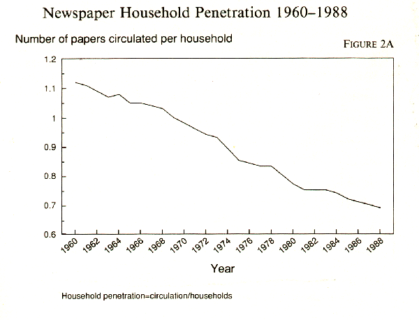
More hints for using the CPI: books older than this one use CPI figures that have 1967 = 100 as the base. The Bureau of Labor Statistics recently converted to the new base where the period 1982-1984 = 100. For some time they will publish both figures. Update your Statistical Abstract every year to stay current. As of this writing, the Statistical Abstract gives a CPI for every year back to 1950. For earlier years, see a beautiful set of volumes called Historical Statistics of the United States.7 It gives all the BLS numbers back to their World War I beginning and then uses estimates from other historical sources to produce yearly CPIs back to 1800. If you need the most recent monthly figure, call this number: (202) 523-9658. A recorded voice will give you the CPI for the most recent month. The monthly figures come in two categories, the CPI-U and the CPI-W. The CPI-U is for all urban consumers and covers about 80 percent of the population. The CPI-W is for urban wage earners and clerical workers. They are collected separately so that the different effects on inflation can be tracked for the two groups (although they overlap considerably). For most public policy purposes, the broader-based CIP-U is used to make inflation adjustments. Adjusting for population growth Trends make news, either because they have been going on quietly and not many have noticed or because of a sudden interruption in a trend. To focus on the newsworthy trend, you have to separate it from all the parallel trends in the background. Population growth is one secular trend that, like inflation, can make other trends be more or less than they seem. The American Newspaper Publishers Association every year issues a booklet of statistical trends in the news business. It shows that newspaper circulation grows a little bit every year in the United States. That sounds like good news for newspapers, but it is not, because the population and the number of households is growing a lot faster. Circulation penetration, defined as circulation divided by households, has been dropping steadily over the years, and that is the number ANPA really cares about, even though it does not publish it in its booklet. It is a number that is easy to understand at the intuitive level. When penetration was at 100 percent in a given market, one newspaper was sold for every household. When it was above 100 percent, more newspapers were sold than there were households -- common in the 1950s. Today the number is much smaller and still falling, with some metropolitan newspapers experiencing household penetration of less than 50 percent. Expressing newspaper circulation as a ratio to households (because home-delivered circulation is sold to households rather than to individuals) makes the real trend easier to see (see Figure 2A).
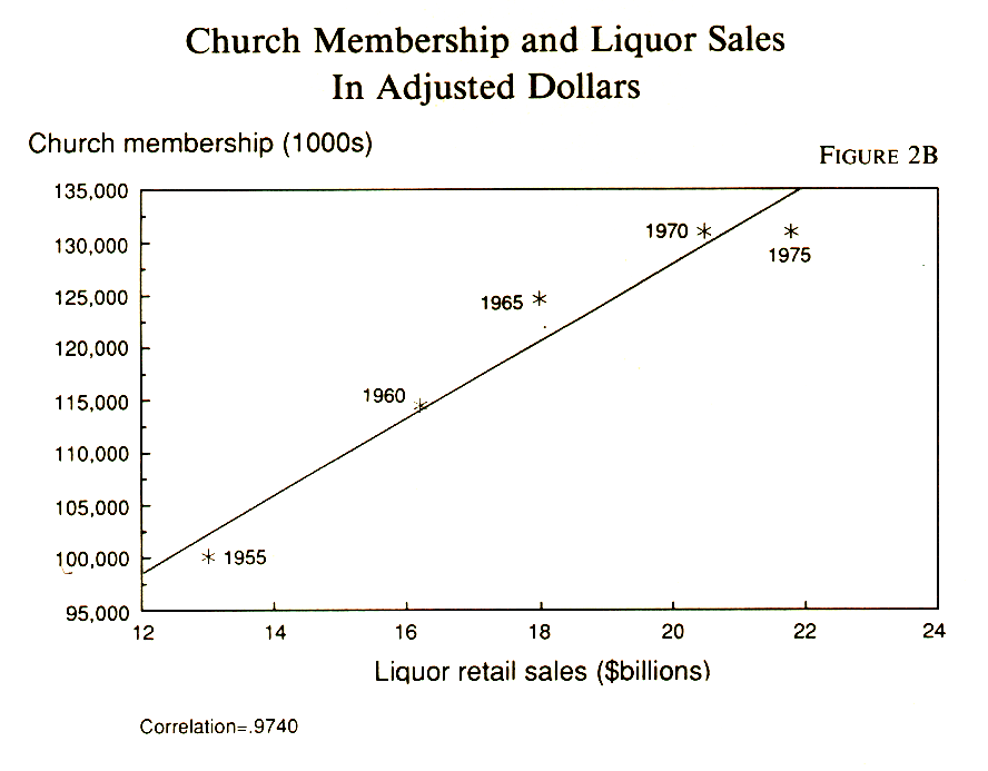
For an extreme example of population growth as a confounding factor, I like to show students a scatterplot showing church membership and alcohol consumption year by year. A scatterplot shows each data point in a two-dimensional space. In this case, the vertical dimension represents church membership (higher is more) and the horizontal dimension represents liquor sales (rightward is more). Each data point is a year, represented by a dot placed according to the church membership and the liquor sales for that year. Just by looking at the scatterplot (Figure 2B), you can see that the greater the church membership, the greater the liquor sales. In fact, the correlation is almost perfect. The fun part is producing theories to explain it -- for example, church-going relieves people of guilt, and so they feel free to drink; or drinking makes people feel guilty, and so they go to church. Of course, both are explained by population growth, and when we detrend the numbers by expressing them as ratios to population, the association disappears.
Where
do you get population numbers to use in detrending? The U.S. census is
collected only every ten years, but lots of organizations produce interim
estimates for the intervening years. Standard Rate and Data Service produces
media audience studies and population estimates, and its reports are available
in larger libraries and in the marketing departments of media organizations.
The Audit Bureau of Circulations has county-level household estimates year
by year. Most newspapers and many journalism schools are ABC members and
have access to its data, both in print form and on PC diskette.
Curve fitting Sometimes interesting trends are confused by a variety of factors, including random error. Survey research based on sample data is subject to random error, particularly when small subgroups are examined. One way to get a clearer picture of a trend is to try to fit it to a smooth line. A straight-line fit works for many kinds of trend data. You can use your calculator or a statistical program, such as SPSS (Statistical Package for the Social Sciences), to do a regression and scatterplot with time as the independent or X variable. The correlation coefficient (chapter 4) will tell you how well your data fit the straight-line model. If it is a good fit, you can even try to predict the future by drawing in the best-fitting straight line and extending it with a straightedge. Such a linear projection tells you what will happen if present trends continue unchanged -- which, of course, they may not do. Nature, unfortunately, is not fond of straight lines. Not to worry. You can use the same regression program to fit a curved line. First, examine the scatterplot and use your imagination to see what kind of a line might fit. If it is a simple curve, one that does not twist in a new direction at some point along its length, you can sometimes straighten it out by reexpressing one of the variables in terms of some nonlinear function. If your curve is hollow upward, to use Tukey's term, try an expression to the right of Y. If it is hollow downward, move to the left. Do the reverse to reexpress the independent or X variable. Check your scatterplot each time you try one of these conversions to see if the curve is straightening out. If it works, and if you try to predict the future with the straightedge technique, remember that it is a prediction based on a transformation of Y or X, and you will have to convert it back before your prediction will make any sense. Here
is an example. David Arant and I wondered if the papers that win the most
Pulitzer Prizes are also the best-edited. We devised a method of measuring
the quality of a paper's basic editing and plotted it against Pulitzer
Prize records for a sample of 58 newspaper organizations. We found a strong
effect for the first few Pulitzers, but it tapered off rapidly after that.
In other words, the effect was nonlinear. You can see it in Figure 2C(1).
The points form a curve instead of a straight line. To straighten out the
curve, we needed to stretch out the Pulitzer scale at the low end, and
the best way to do that turned out to be to use the square root of the
Pulitzer score in place of the raw score as the independent or X variable.
Further straightening was obtained by eliminating an "outlier." The Associated
Press, with its high rate of bad spelling and high Pulitzer rate, was clearly
in a class by itself. By confining the study to newspapers, we got a closer
approximation of a straight line. The result is in Figure 2C(2). That gave
us a statistically significant correlation. The moral is that is a good
idea to always look at the scatterplot before dealing with correlation.
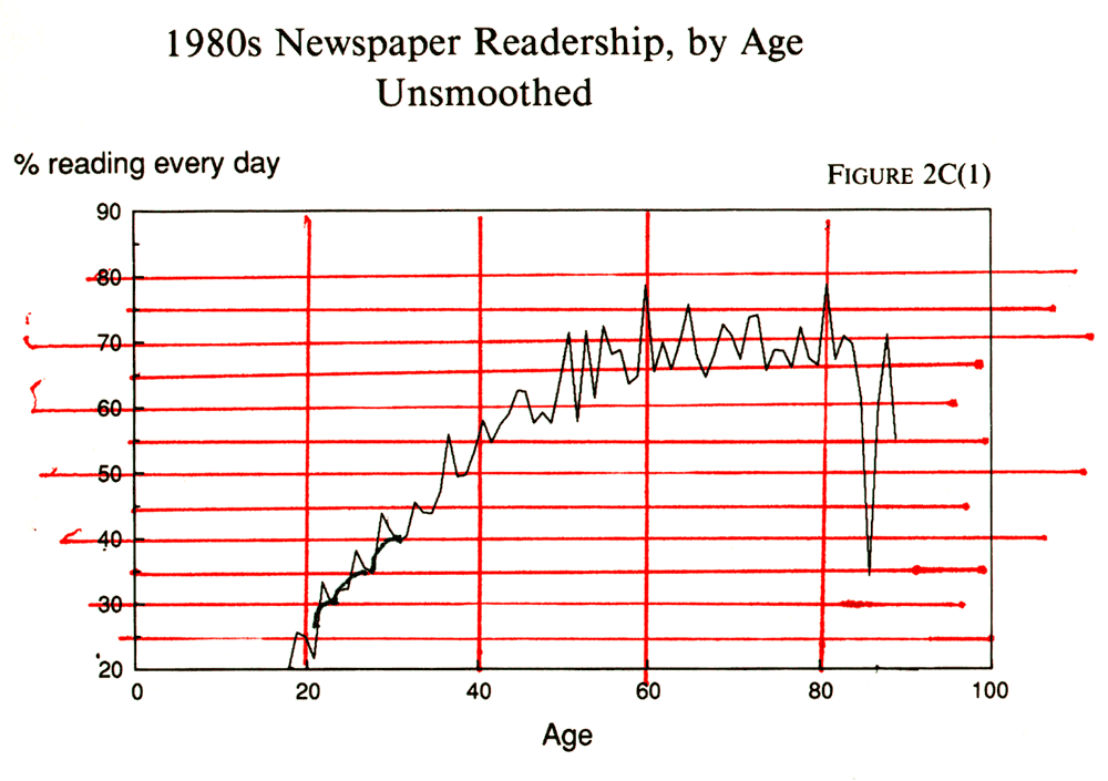
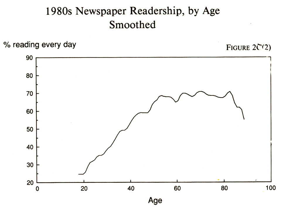
If nature does not like straight lines, she is not too fond of smooth logarithmic curves, either. The most interesting trends are often those that twist and turn the most exotically. Tukey has a procedure for dealing with such convoluted data that he calls "smoothing." The theory behind smoothing is that measurement error is itself a secular trend and can be taken out by using each point as a check on the neighboring points. A rolling average is a fairly familiar method of smoothing. If you have monthly data that need smoothing, express January as the mean of December, January, and February. Then for February, use the mean of January, February, and March. Tukey's recommendation is to use rolling medians of three rather than means. Here's how to do that: compare each data point with those on either side and then replace it with the middle one of the three. For example, in the series 324, the two would be changed to a three because three is the median of the set. That way, wildly out-of-range points will be buried. That's good, says Tukey, because those oddball points catch the eye and make it difficult to see what is really going on. "The value of smoothing," he says, ". . . is the clearer view of the general, once it is unencumbered by detail."8 In other words, it is exactly what a journalist needs. And if one smooth of running medians of three leaves some jagged places, Tukey recommends doing it again -- and again -- until smoothing no longer changes things. There are more complicated ways to smooth, and they are beyond the scope of this book. See Tukey's work for details or try one of the smoothing routines in SYSTAT, a popular software package for statistical routines.9 Figure 2C(1) shows a plot of daily newspaper readership by exact age. Its purpose is to see how readership changes according to life stage. The smoothed version, 2C(2), makes this clearer.
Index numbers Another way to achieve clarity for analysis and communication is to use index numbers. The CPI is a good example of an index number. With 1982-1984 set at 100, and September 1989 at 125, you know that prices rose 25 percent from the base period. Newspaper
advertising sales people sometimes use index numbers to compare a newspaper's
audience with its market. If 35 percent of the adults in the market have
college degrees and 47 percent of the readers have college degrees, the
index is 134. This is another way of saying that the rate of college graduation
is 34 percent higher among readers than in the market as a whole. By applying
this indexing to a variety of competing media, the ad salesman can make
the case that his paper's readership is more upscale and has more buying
power than the raw circulation numbers would indicate.
Seasonal adjustment Yet another form of detrending is seasonal adjustment. When the Bureau of Labor Statistics issues its monthly unemployment figures, it gives us numbers that can be directly compared from one month to the next so that we can see at a glance whether things are getting better or worse. But
unemployment is seasonal. School openings and closings and climate conditions
can affect the number of people looking for work at different times of
the year. To assess the health of the economy, we are interested in the
month-to-month changes that cannot be ascribed to the seasonal variation.
The BLS statisticians perform this detrending by looking at past seasonal
changes and assuming that the current year will not be very different.
Then they subtract the portion attributable to the change in season and
report the rest. There is some risk in this, of course, because the seasonal
variations are not uniform from year to year. But it is better than not
doing it at all. If the White House puts out unemployment numbers in the
fall of an election year that show a dramatic drop in unemployment, careful
reporters will check to be sure that the seasonal adjustment has not been
omitted. If it has, the decline can be merely the result of much of the
teenage labor force going back to school.
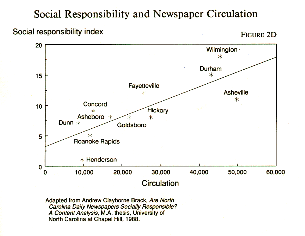
Regression residuals A statistical technique for detrending comes in handy when you need to control for some overpowering continuous variable that conceals most of what you are interested in. Andrew Brack was studying the editorial quality of newspapers in North Carolina, but he was handicapped by the fact that circulation size explains most of the variance. Bigger papers have more resources, and so they give their readers more for their money. Brack nevertheless assembled a sample of large and small papers, measured them on a number of indicators of editorial quality, combined the indicators into an index and plotted them on a chart. See Figure 2E for the result. The vertical axis represents quality and the horizontal axis represented circulation. When each paper is plotted on the chart, their distribution approximates a straight line.
Using
the general linear model (GLM) to plot the best-fitting straight line for
describing the effect of circulation on quality, Brack then turned his
attention to the deviations from that line. Some papers were much higher
in quality than would be predicted by their circulation
size, and others were much lower. By measuring those deviations from what
circulation would predict, he obtained a detrended measure of quality that
eliminated the effect of circulation size. The technical term for this
technique is residual analysis, because it looks at the residual
variance, or the variance that is left over after circulation size explains
what it can. (Chapter 4 will have a fuller explanation.)
Standardized scores Another way to put apples and
oranges on a comparable basis is to use standardized or z-scores,
which reexpress each measurement in terms of how much it deviates from
a group average. It is useful if you have a number of measures to combine
into an index but can't use simple addition because each measure is on
a different scale. A z-score is a measure of relative peculiarity. Calculating
it requires some knowledge of statistics, and it, too, will be discussed
more fully in chapter 4.
Notes 1. Wall Street Journal, October 16, 1989, p. C14. return to text 2. Associated Press, time stamp 2026EST, November 18, 1986. return to text 3. Thomas D. Cook and Donald T. Campbell, Quasi-Experimentation: Design and Analysis Issues for Field Settings (Boston: Houghton Mifflin, 1979), p. 323. return to text 4. Jim Stewart and Andrew Alexander, "Assault Guns Muscling In On Front Lines of Crime," Atlanta Journal-Constitution, May 21, 1989, p. 1. return to text 5. BLS Handbook of Methods: Vol. II, The Consumer Price Index (Washington: U.S. Government Printing Office, 1984). return to text 6. David H. Weaver and G. Cleveland Wilhoit, The American Journalist: A Portrait Of U.S. News People and Their Work (Bloomington: Indiana University Press, 1986), p. 82. return to text 7. Historical Statistics of the United States: Colonial Times to 1970, Bicentennial Edition (Washington: U.S. Government Printing Office, 1975), p. 211. return to text 8. John W. Tukey, Exploratory Data Analysis (Boston: Addison-Wesley, 1977), p. 205. return to text 9. Leland Wilkinson, SYSTAT: The System for Statistics (Evanston, Ill.: SYSTAT, Inc., 1988). return to text |
|||||||||||||||||||||||||||||||||||||||||||||||||||||||||||||||||
Download Chapter 2 |
||||||||||||||||||||||||||||||||||||||||||||||||||||||||||||||||||